
Atomic design system implementation using Storybook
Maintaining an ever-evolving application is not an easy task. Imagine if you have different types of UI elements across multiple pages, and similar UI elements are also displayed on other pages. It will be difficult to maintain them. Moreover, if we want to change several UI elements that should be applied to all pages, it will be a hassle to change the elements one by one.
Yes, it's nothing new to solve this kind of problem. Many of us implement component-based UI elements. So we can reuse that component across multiple pages that implement the same UI element. But we have another problem with this. Imagine that there are some changes in one small part of a UI element that needs to be changed to other related elements as well. For example, we need to change some button elements. And this button element is used in several other UI element components like cards, accordions, and many other components. Then this condition will be difficult to maintain. There is a possibility of inconsistent UI for each and other UI element. So, we need another approach to solve the problem.
Atomic Design
Atomic design is a popular approach to modern UI element design and development. It was pioneered by Brad Frost in 2013 and has been universally adopted as a component that focuses based on chemical elements.
Core Concepts
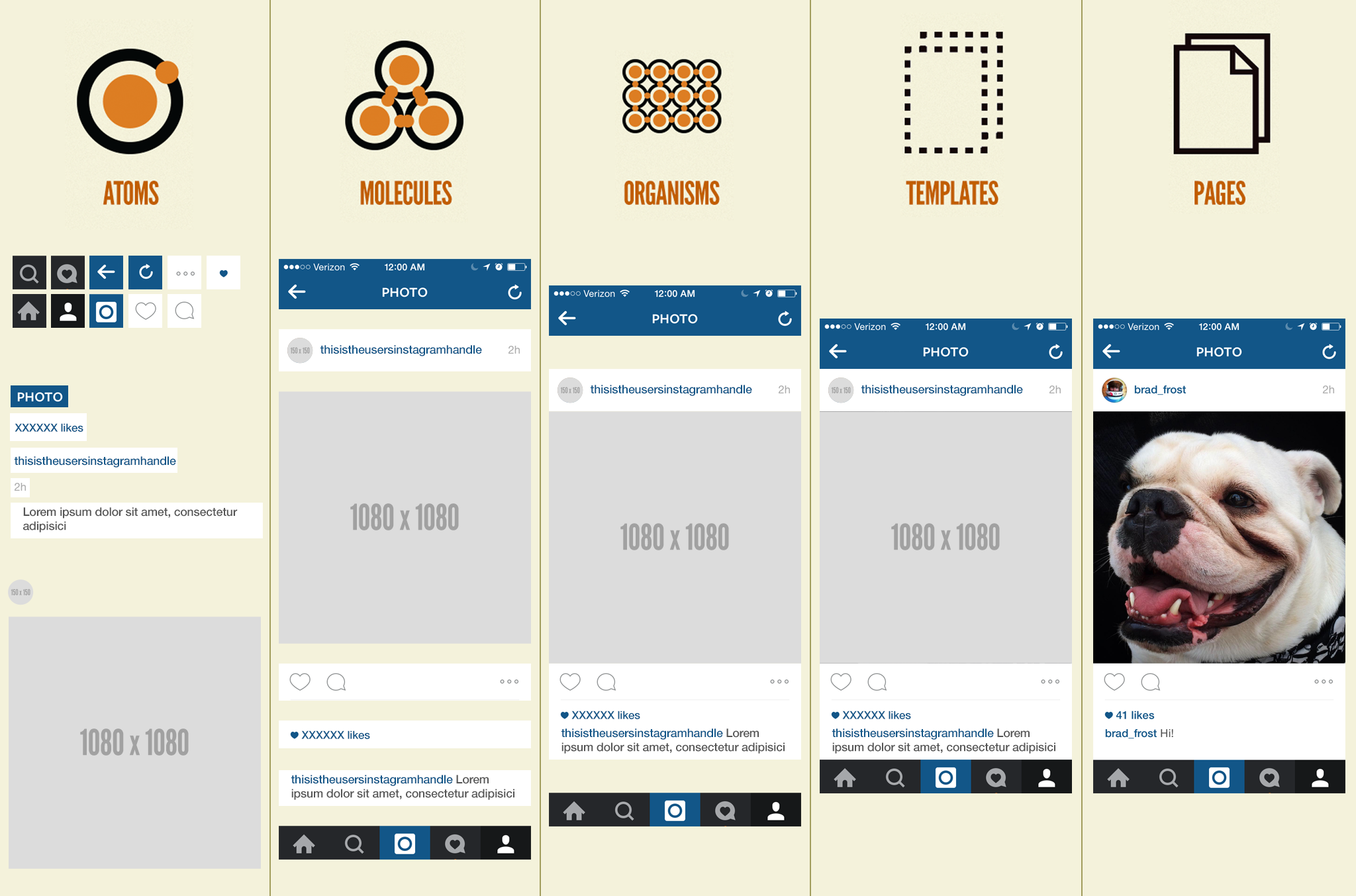
Brad has five core concepts of atomic design:
- Atoms - Atoms are the smallest component found in a product or system. These usually include links, buttons, inputs, paragraphs, titles, icons, and labels.
- Molecules - Molecules are combinations of atoms. They can include navigation lists, input groups, text groups, and other structures made up of multiple atoms.
- Organisms - Organisms, again, are larger than atoms and molecules. They are a combination of molecules or atoms and molecules. Organisms can include banners, call-to-action sections, footers, headers, forms, and any large structure you find on the page.
- Templates - Templates are a typical layout pattern that you find system-wide. For example, a blog post will have a template and a product page also will have a template. A template is a page with a standard layout consisting of organisms and molecules.
- Pages - Lastly, pages are the highest-level methodological concepts. Pages are unique layouts that don't need to be repeated throughout your app. The difference between pages and templates is that templates don’t provide any content.
Benefits of Atomic Design
Atomic designs require more thought, consideration, and planning, but they are well worth the effort. So, what are the main benefits?
- Building a component-based system - When we break down components into elementary atoms, it becomes easier to see what atoms can be combined to form larger elements (molecules or organisms).
- Style guide creation becomes simple - Applying atomic design principles from the start can keep your designs consistent across platforms.
- Easy-to-read code - UI code designed 'atomically' is much easier to read than that created more traditionally. Consistency is the key that makes it easy to see which components are used for different parts within application. This reduces the tendency for duplicate code on the site.
- Faster Prototyping and updating - Having the atomic list defined before the development process begins means you can create mock pages quickly and easily. Like building a lego, you can pick and combine the necessary elements for the site. If an update is needed, only one atom, molecule, or organism is changed at a time. This simplifies any updates to the component.
By breaking a page down into these different elements, we create a mental model that helps with constructing a UI. As Stephen Hay says:
‘We’re not designing pages. We’re designing systems of components.’
By using atomic design, the whole team can benefit from its advantages. You can explore more about atomic design system by reading Atomic Design by Brad Frost.
Implementations of Atomic Design
We implement atomic design system in the separated project as a library in our NPM registry. So, it can be used by any Halodoc application. To facilitate project mapping based on the atomic design system, the first thing we do is define a structure directory.
├── projects
│   ├── atoms
│       ├── button
│       ├── link
│       ├── chip
│       ├── ...
│   ├── molecules
│       ├── snackbar
│       ├── alert
│       ├── bottom-sheet
│       ├── ...
│   ├── organisms
│       ├── card
│       ├── header
│       ├── footer
│       ├── ...
│   ├── templates
│       ├── doctor-profile
│       ├── article
│       ├── ...
As seen in the structure directory, we separate NPM package based on atomic design element. As a result, there will be four NPM packages in this project:
- @halodoc/atoms
- @halodoc/molecules
- @halodoc/organisms
- @halodoc/templates
There is no pages element because it will be implemented at application level.
Storybook
Storybook is an amazing tool to organize UI components. Storybook is a component playground, a component visualizer, a documentation hub, a prototyping environment, a testing platform, a design review tool, and many more.
There are similar tools for component playgrounds other than Storybook, such as Angular Playground. Compared to Storybook, Angular Playground provides fewer features. The key feature of Storybook (compared to other tools) is Addons that extend Storybook’s UI and behavior. So by using Storybook, we can easily add new feature based on our needs by installing an Addons. For example, if we need to include a design screen in our Storybook, the thing that we need to do is just install Storybook Addons Design. Awesome, right? You can explore more about it on storybook's official page.
Benefits of using StoryBook
Using Storybook will provide us with several benefits. Here are the details:
- Connects the dots between the design system and the products. By having components and low-level pages under one roof, we can connect the dots between the components of a design system and the products that those components serve.
- Reduces the UI feedback loop - Placing components in Storybook significantly reduces feedback for validating components. For example, if the design team or QA engineers want to validate a component, they can simply open the Storybook without having to implement it in an application code.
- Allows teams to quickly demonstrate product states - What does this page look like in English? Bahasa Indonesia? What happens if our product grid shows 12 products instead of 6? What if we have two promo codes instead of three here? The ability to quickly indicate the status of different products is a powerful concept and creates an essential distinction between UI code and application code.
- Documentation tools for developer - By using Storybooks, the developer can easily see the list of available components and how to use them in application code. So it will reduce the development process.
As you can see, there’s just so much great benefits by placing components in Storybook.
Atomic design implementation in storybook
Storybook allows you to separate components based on the atomic design system (atoms, molecules, and organisms).
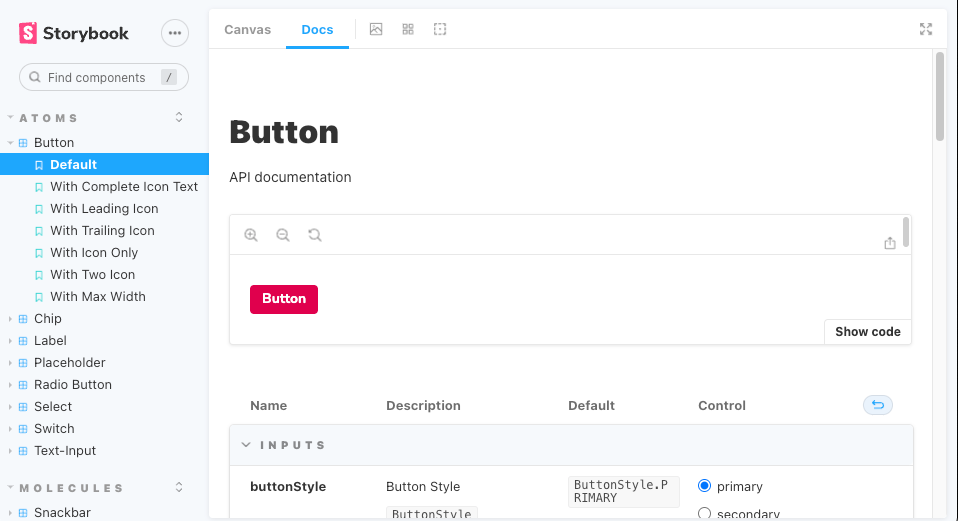
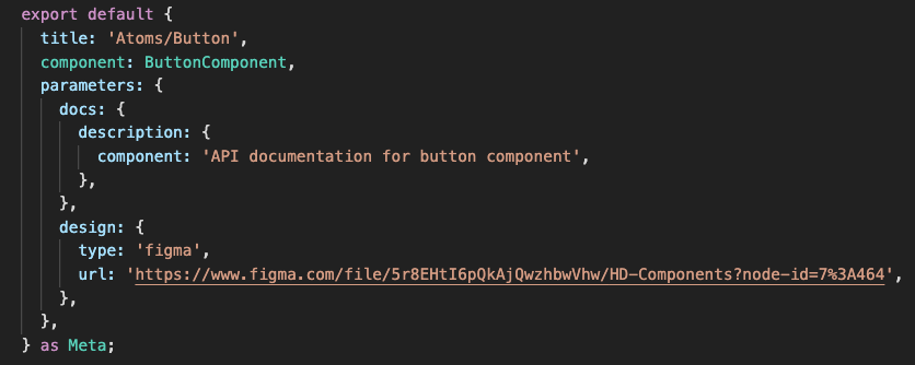
Each of our components has a .stories.ts file colocated with the source files:
And inside of that .stories.ts file we are able to provide informations and settings to the component:
From there, we can write our stories for the component to do our development process. This is the first thing we do, where the following process completes the component scenario based on the one provided by the design team.
As mentioned earlier in this article, we can add addons to customize the storybook based on our needs. By default, there are two addons embedded once we installed the storybook, Links Addon and Essentials Addon. Links Addon is used to create links that navigate between stories in Storybook. And, Essentials Addon is used to extend these functionalities:
But of course, if we don't need some of those functionalities, we can easily adjust the functionalities based on our needs.
Apart from those two default addons, we added two more additional addons to our storybook:
1. Design Addon
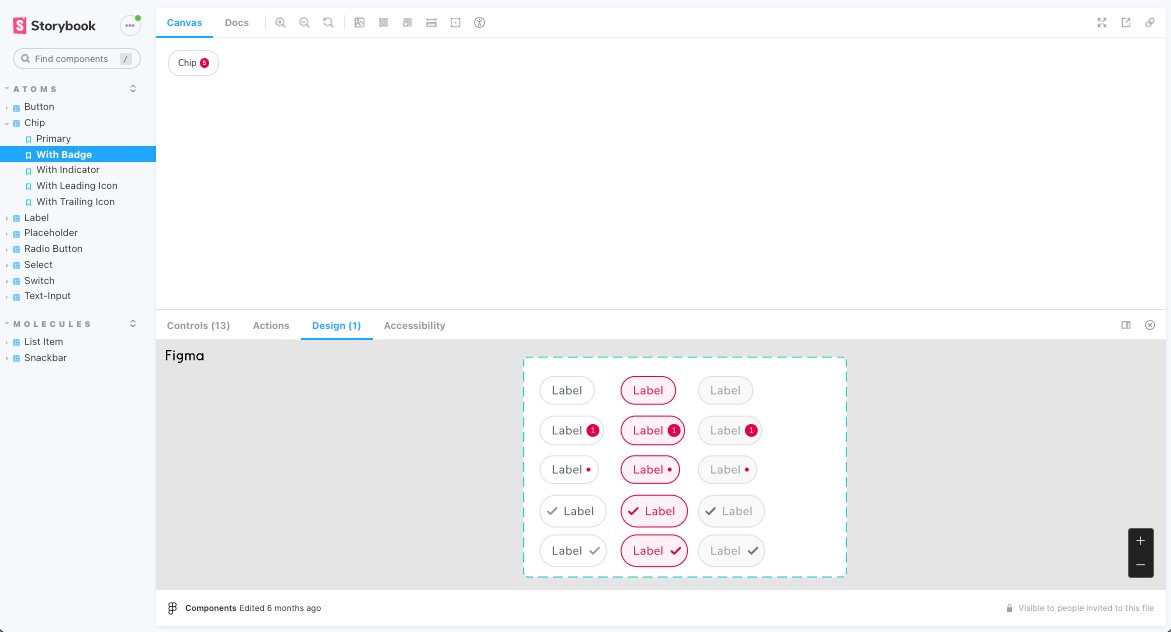
Design addon is used to embed Figma or websites in the addon panel for better design-development workflow.
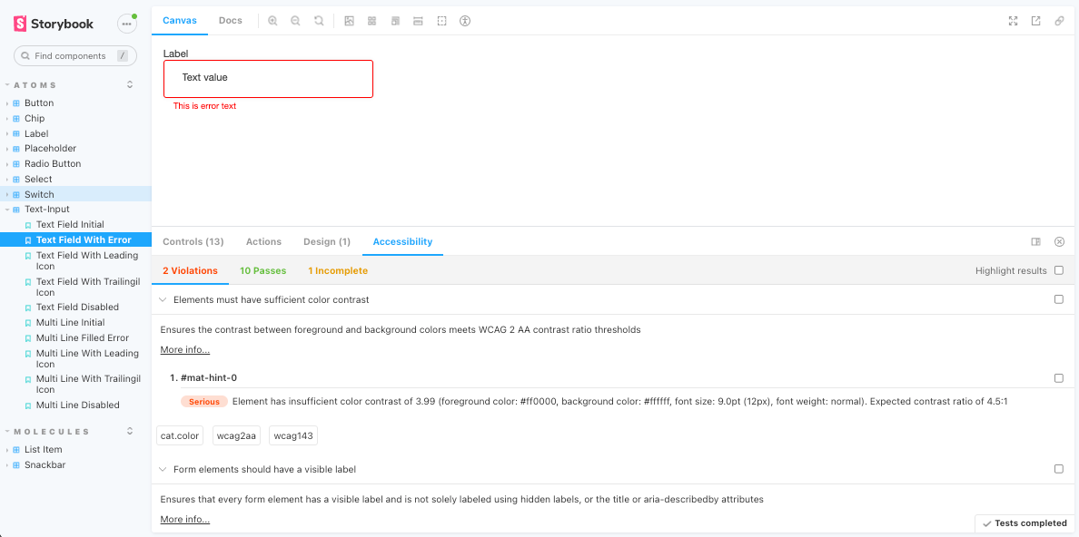
Accessibility addon will provide information about how to make our UI components more accessible. As seen in the image, the addon provides information to improve our component based on accessibility guidelines.
Storybook for mobile application
Storybook is popular for placing web components because of the huge benefits of using it. But, how about mobile components? Is it possible to place mobile components in storybook? The answer is, yes, it's possible now. Cool, right? Let me explain how to do that.
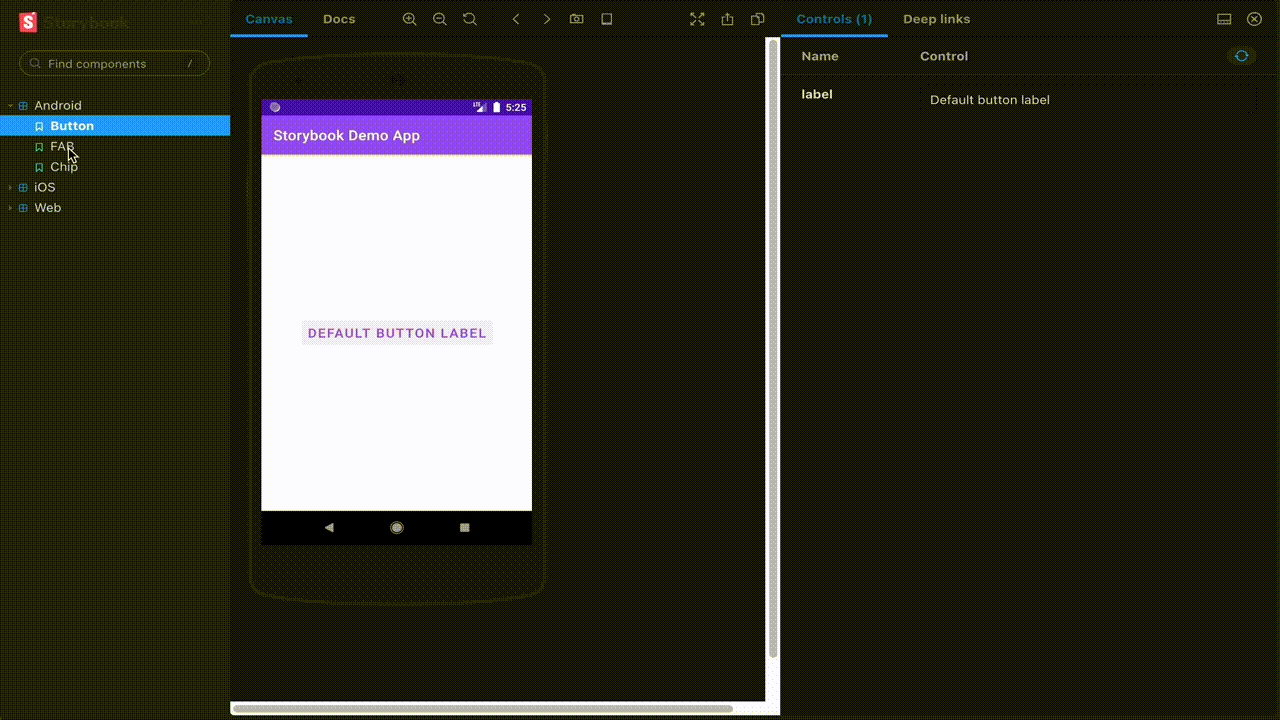
Having a single place where both web and mobile components live would be particularly valuable. Thanks to Storybook Native and appetize.io for making this possible. Appetize.io allows us to run native mobile applications in the browser. Storybook Native is an extension of the normal web storybook that uses appetize.io to render your mobile application in an emulator that can be interacted with the browser. Because of that, we can share native mobile components with web components in the same place. More detailed implementation can be seen in Storybook Native.
Maintaining CI/CD pipeline for the project
The result of this project will be published to our NPM registry and deployed the storybook to our internal web application. We need to define CI/CD pipeline for automatic deployment to save the developers time for publishing NPM package and deploying storybook manually.
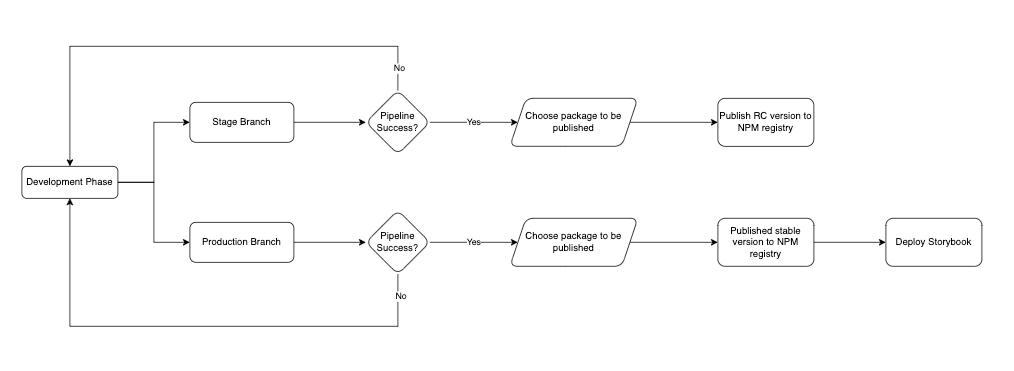
As seen in CI/CD pipeline diagram, we are running the project in two separate environments:
- Stage environment is used for development purposes. When the developer pushes the changes to the stage branch, it will run CI/CD pipeline such as unit tests, sonarqube scanner, and build the project. Once succeeded, the developer will choose a package to be published (e.g. atoms or molecules or organisms or templates). Then, the pipeline will build the package based on the package chosen by the developer. Once built success, it will publish to the NPM registry as an RC (release candidate) version for testing purposes in other projects.
- Production environment is used for a development-ready purpose. Similar to the stage process, the difference is that there is another process after success published to NPM registry. It will deploy storybook to our internal design system as a web application.
Conclusion
We are just getting started and are still in the migration stage to the atomic design system. Currently, we are using Storybook for web applications. But in the future, we plan to use Storybook as a design system language not just for web applications, but also for mobile applications (Android and iOS).
This process does add some overhead not only from the developer side but also from the designer side. But at the same time, if the atomic design system has been implemented, we believe that this will simplify the development and maintenance applications.
Join us
Scalability, reliability and maintainability are the three pillars that govern what we build at Halodoc Tech. We are actively looking for engineers at all levels and if solving hard problems with challenging requirements is your forte, please reach out to us with your resumé at careers.india@halodoc.com.
About Halodoc
Halodoc is the number 1 all around Healthcare application in Indonesia. Our mission is to simplify and bring quality healthcare across Indonesia, from Sabang to Merauke. We connect 20,000+ doctors with patients in need through our Tele-consultation service. We partner with 3500+ pharmacies in 100+ cities to bring medicine to your doorstep. We've also partnered with Indonesia's largest lab provider to provide lab home services, and to top it off we have recently launched a premium appointment service that partners with 500+ hospitals that allow patients to book a doctor appointment inside our application. We are extremely fortunate to be trusted by our investors, such as the Bill & Melinda Gates Foundation, Singtel, UOB Ventures, Allianz, GoJek, Astra, Temasek and many more. We recently closed our Series C round and In total have raised around USD$180 million for our mission. Our team works tirelessly to make sure that we create the best healthcare solution personalised for all of our patient's needs, and are continuously on a path to simplify healthcare for Indonesia.