
Leveraging CompositionalLayout for complex layout design in iOS app development
At Halodoc, we are always ready to adopt the changes and make the iOS Mobile app user-friendly. Based on UX we have to adopt the design changes which will solve the end-user problem. So, to achieve the UX-based design we have to be ready with a flexible design. So Collection view is one of them which is helping us to do so. First, let's understand the problem statement.
Problem Statement
We are using collection views at multiple places and for multiple purposes. However sometimes while designing the complex UI we are using collection view inside table view cells or collection view inside collection view cells.
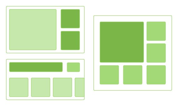
Let’s see some of the examples, which will come in our day-to-day development. Before Compositional Layout we are doing some work around the layout so that it should match with the above design. But now by using compositional layout we can do it a little quick and easy way.
Let’s understand how the compositional layout is designed to solve such kind of problem.
The solution
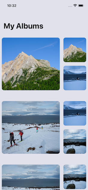
We will take the first example to understand the layout structure which will give us an idea of how we can design such kind of irregular design.
Compositional Layout is having below major component which is going to define the collection view layout.
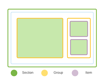
Section:
In the above diagram, Section is the Green color part. Sections are a collection of items that logically belong together. In this example, all three light green color box belongs to one section. Similarly in the Photo app, we can club all the Photos based on Date and each month-based photo can belong to one date section.
Group:
A group is a collection of similar types of Cells. A group can have multiple items or one item.
In the above diagram yellow color is the group.
Item:
Items can be considered as individual cells. In the above example, purple color boxes are items.
So a section can have multiple groups and groups can have multiple items and based on this combination we can design the above collection view.
Core Concepts
To build any compositional layout, the following four classes need to be implemented:
NSCollectionLayoutSize — The width and height dimensions are of the type NSCollectionLayoutDimension which can be defined by setting the fractional width/height of the layout (percentage relative to its container), or by setting the absolute or estimated sizes.
NSCollectionLayoutItem — This is your layout’s cell that renders on the screen based on the size.
NSCollectionLayoutGroup — It holds the NSCollectionLayoutItem in either horizontal, vertical, or custom forms.
NSCollectionLayoutSection — This is used to initialize the section by passing along the NSCollectionLayoutGroup. Sections eventually compose the compositional layouts.
We have few new changes in terms of adjusting and dealing with dimension
.fractionalWidth(float): dimension is computed as a fraction of the width of the containing group
.fractionalHeight(CGFloat): dimension is computed as a fraction of the height of the containing group
.absolute(CGFloat): dimension with an absolute point value
.estimated(CGFloat): dimension is estimated with a point value. The actual size will be determined when the content is rendered.
Let’s implement these concepts.
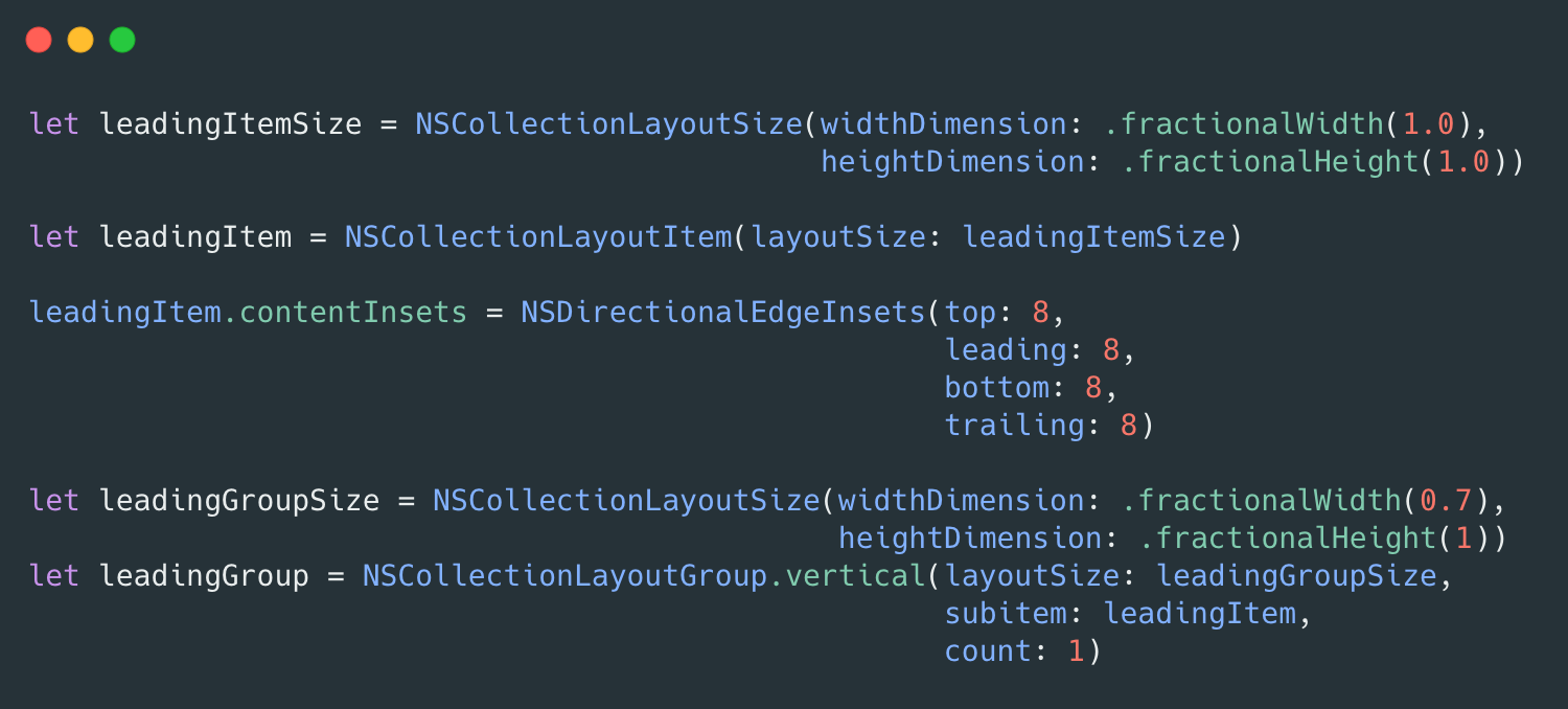
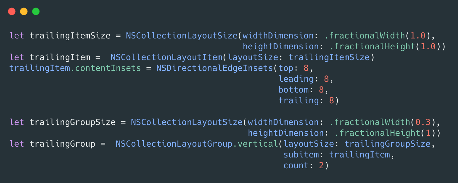
In the above code, we have defined the leading Group.
NSCollectionLayoutGroup which needs input of NSCollectionLayoutItem and NSCollectionLayoutSize.
We have defined the leading item size and then layout size. Here group size width is 0.7 (means 70% of the container) so the remaining 0.3 (means 30% of the remaining container) will be available for the trailing item.
Post this we have to define the container.
It's just an NSCollectionLayoutGroup.
As if we check the above code all the places we have defined the layout group.
In leading we have one item, in trailing we have 2 items. And finally, we have one single layout with a combination of leading and trailing.
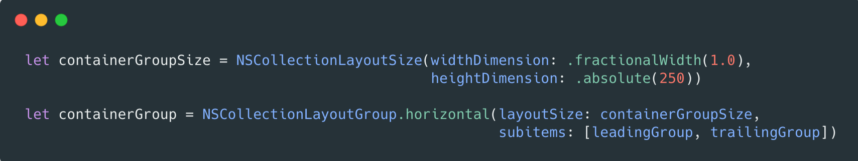
Here we can see the .absolute(250) which will be customized based on design.
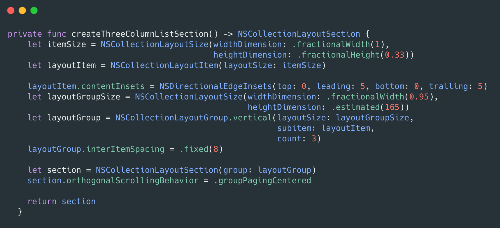
Finally, we are ready to use all the above codes in NSCollectionLayoutSection.
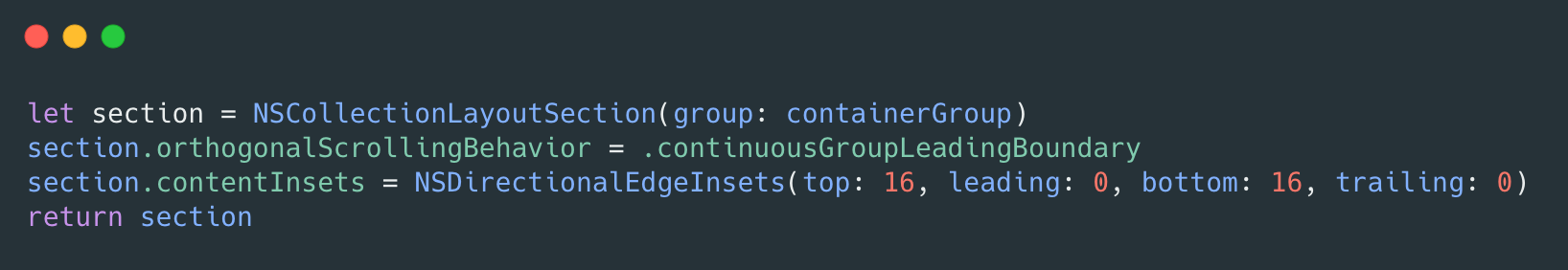
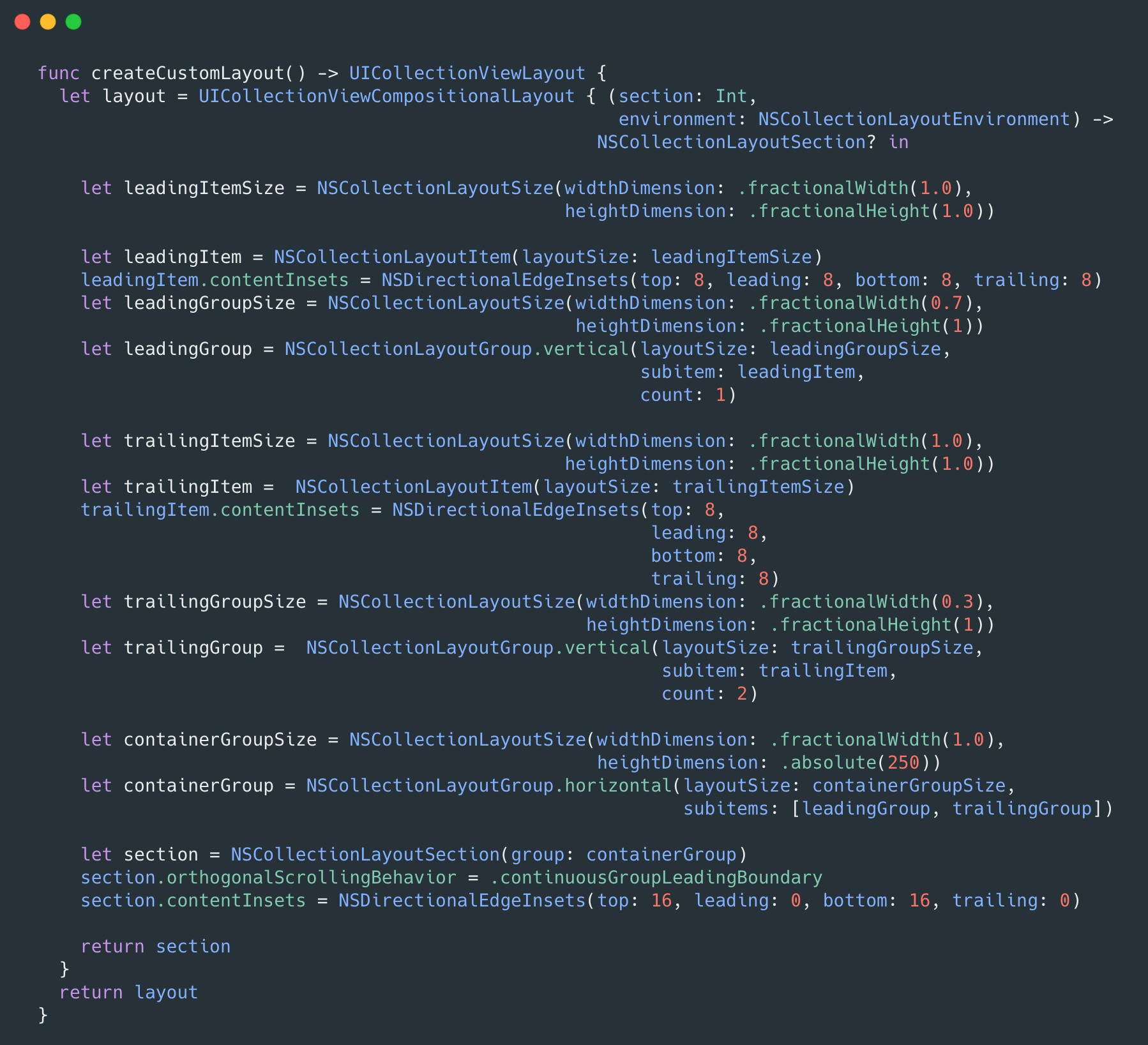
The above code is an example of one of the layout and outcome will look like this.
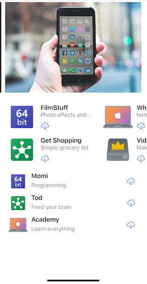
So now we can implement this kind of layout. Let's make a little more complex layout. Like iOS App Store.
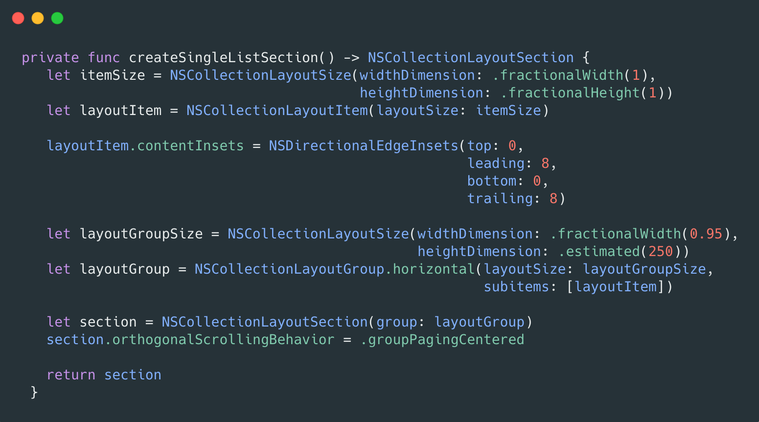
Let's create the First Section Layout
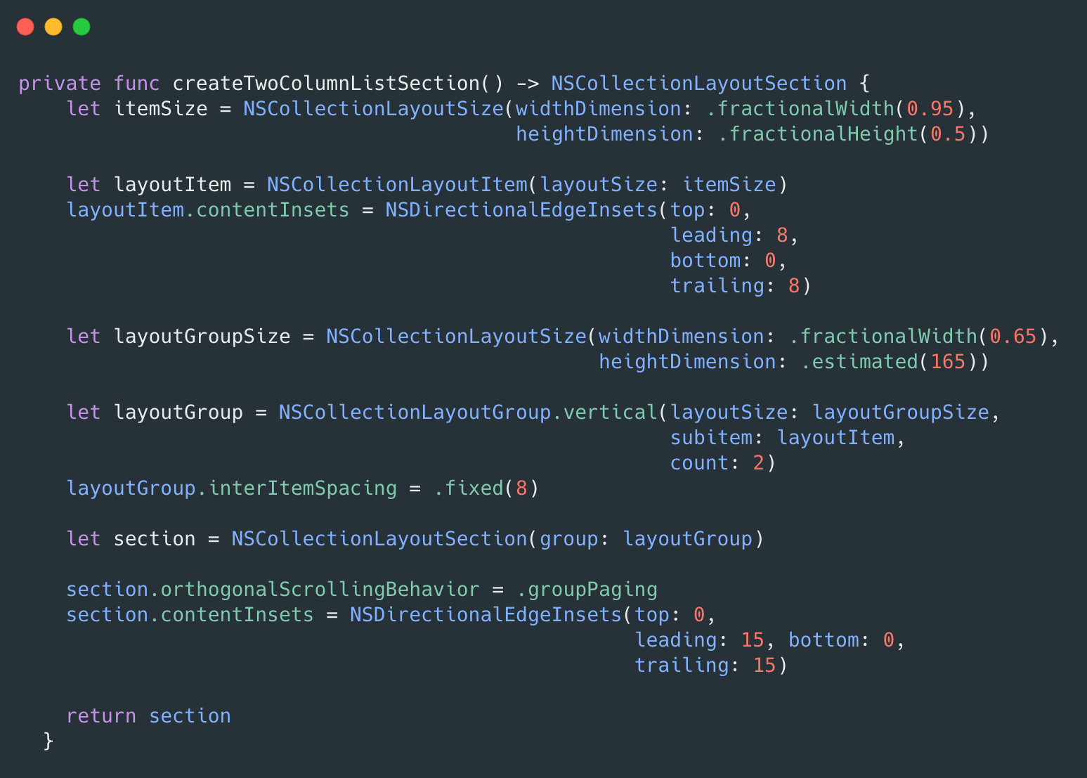
For Second section this will be the code
For third section
Finally, we can add all three layouts to one place and return the UICollectionViewCompositionalLayout. which will make out UI similar to an app store.
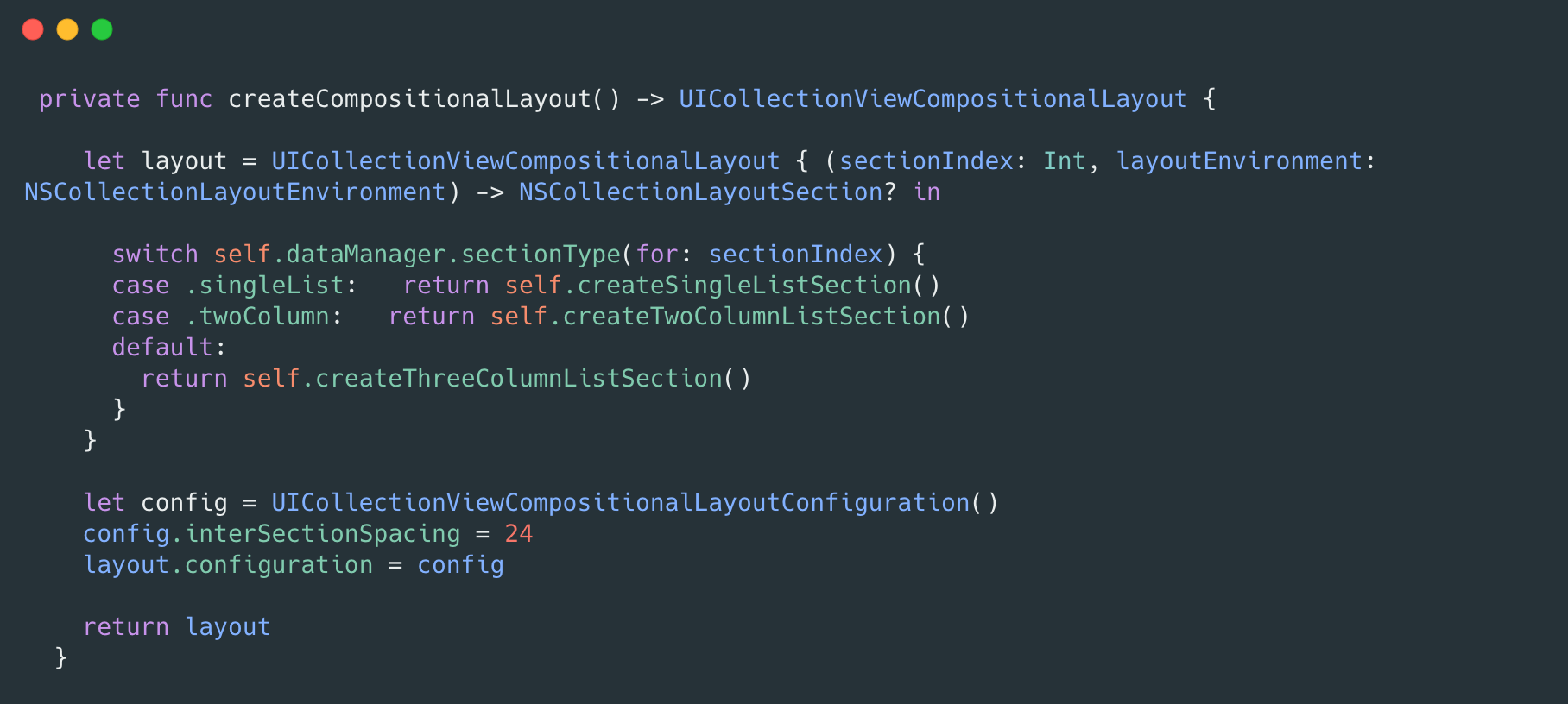
So based on UI complexity we can plan to use a Compositional layout and define the items, group, and section which will produce the desired output.
Advantages Of Compositional Layout
- Design any kind of layout
- We can have multiple scroll behaviour based on Section
- Each Section can be customized based on a different layout
- Managing the Supplementary view is also easy
- No Impact on performance, it was as smooth as Collection view.
References:
- https://developer.apple.com/documentation/uikit/views_and_controls/collection_views/implementing_modern_collection_views
- https://www.raywenderlich.com/5436806-modern-collection-views-with-compositional-layouts
Join us
Scalability, reliability, and maintainability are the three pillars that govern what we build at Halodoc Tech. We are actively looking for engineers at all levels and if solving hard problems with challenging requirements is your forte, please reach out to us with your resumé at careers.india@halodoc.com.
About Halodoc
Halodoc is the number 1 all-around Healthcare application in Indonesia. Our mission is to simplify and bring quality healthcare across Indonesia, from Sabang to Merauke. We connect 20,000+ doctors with patients in need through our Tele-consultation service. We partner with 3500+ pharmacies in 100+ cities to bring medicine to your doorstep. We've also partnered with Indonesia's largest lab provider to provide lab home services, and to top it off we have recently launched a premium appointment service that partners with 500+ hospitals that allow patients to book a doctor appointment inside our application. We are extremely fortunate to be trusted by our investors, such as the Bill & Melinda Gates Foundation, Singtel, UOB Ventures, Allianz, GoJek, Astra, Temasek, and many more. We recently closed our Series C round and In total have raised around $180 million for our mission. Our team works tirelessly to make sure that we create the best healthcare solution personalized for all of our patient's needs, and are continuously on a path to simplify healthcare for Indonesia.