

Simplifying Angular Library Docs with Storybook
Libraries have been very important in making our code more scalable, minimizing duplication, and simplifying maintenance. However, as libraries grow, managing them becomes increasingly complex. At Halodoc, we noticed this challenge as our web ecosystem, built using Angular, started to grow. Developers needed an efficient way to discover, understand, and leverage existing components without wasting time navigating the codebase.
To address this, we adopted Storybook, a powerful tool that has centralized our component documentation, improved consistency, and enhanced efficiency. This blog explores how Storybook has transformed the way we manage our libraries documentation, highlighting its key features, implementation strategies, and overall impact on our workflows.
What is Storybook?
Storybook is an open-source tool for building, testing, and documenting UI components in isolation. It provides a dedicated environment where developers can visualize and interact with components without relying on the larger application.

By enabling developers to build and test components independently, Storybook not only ensures their reliability but also enhances collaboration by providing a single source of truth for all components.
Why Use Storybook for Angular Libraries?
Storybook offers specific advantages when working with Angular libraries:
- Centralized Documentation: Storybook serves as a single repository for reusable components, making them easy to discover and integrate.
- Enhanced Development Workflow: Developers can build and test components in isolation, reducing the risk of integration issues.
- Addon Support: Storybook supports a variety of addons that improve functionality, such as accessibility testing and design integration.
- Open source: Storybook is open source that means it's free to use and continuously improved by a large community of developers.
Setting Up Storybook for Angular Components
-
Initialize Storybook
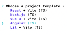
To begin, use the following command to initialize Storybook in your project:npx storybook@latest initDuring the setup process, you'll be prompted to choose a project template that fits your needs.
-
Launch Storybook
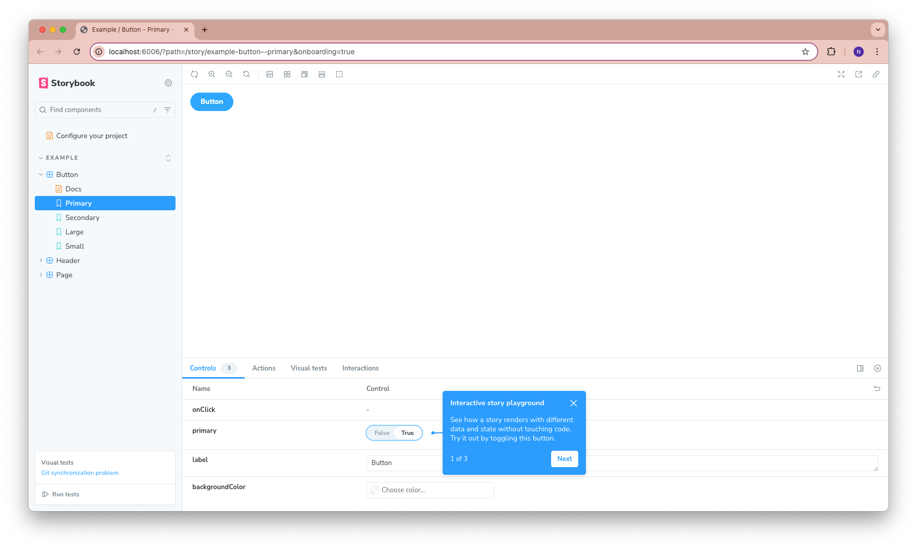
Once initialization is complete, Storybook will automatically start and open in your default browser, giving you a live preview of your project. If you need to launch it later, simply run the following command:npm run storybook
- Explore the Project Structure
After setup, you’ll see the default Angular project structure enhanced with Storybook-specific folders. Key additions include:.storybookfolder: This folder contains configuration files that define how Storybook operates. Two important files are:main.js: This is the core configuration file. It specifies the addons you’re using, the location of your stories, and how Storybook should process your files (e.g., Webpack settings).preview.js: This file customizes the rendering of stories. You can use it to define global decorators, parameters, and theming options that apply to all stories.
storiesfolder: Contains example stories to help you get started with documenting and testing components.
Writing a story
A story is an isolated example showcasing how a component looks or behaves with specific inputs or configurations. It represents a single use case that enables developers, designers, and testers to interact with the component independently of the rest of the application. For example, we can preview various visual states of a button component, such as its default appearance and variants like Primary, Secondary, Plain, or With Leading Icon.

Story is part of a structured data format known as Component Story Format (CSF). All stories are named with a .stories file extension, which makes them easy to differentiate from component code, even though they exist side by side in a project directory.
Below is an example of button component declaration which is part of our design system library. Let's write the documentation!


Declaring stories
At Halodoc, we group story files based on the library where the component is declared. Inside src/stories, we create directories like hd-base, commons, and others, which represent the names of our web libraries.
Inside a story, we declare Meta, which is metadata to configure what we want to show in our documentation.
The Title defines the structure of the stories, similar to the concept of a menu and submenus in a web sidebar. Since we group the components based on the library name, in the above example, the Button story will appear under the "HD Base" menu, then the "Atoms" submenu.
The above story is still empty; we need to declare the variants of the button component that we want to show.

See the code above for how we declare the Primary button variant. We use args to define all arguments that need to be passed to the button. In this case, we define the arguments label, buttonStyle, and buttonSize, which are also the input directives of the ButtonComponent itself.
Now our stories will look like this.

Similarly, to declare other button variants, we export other stories, such as Secondary and Plain.

There are cases in Angular component where we use the content projection to handle dynamic or custom contents, such as our Button with Leading Icon variant.
To achieve this, we need to import the icon component from MatIconModule and the CUSTOM_ELEMENTS_SCHEMA inside the Meta under the decorators property. Then, in the story declaration, we need to add the render argument containing the props and template.
Adding the Docs
Now that we have declared the button variants, it is important to add a documentation section explaining everything about the component, such as how to use it and the directives. To enable Storybook Docs, we need to install it by running:
npm install @storybook/addon-docsThere are three options for declaring the Docs page: using Autodocs, MDX, and Doc Blocks.
- Autodocs
Autodocs allows us to get the auto-generated documentation by simply adding tags:["autodocs"]inside theMeta. With Autodocs, we automatically get the Docs page containing the component name, the code we can use for the component, the provided directives with interactive controls, and all the component stories. - MDX
If we want to write more customized and flexible content, MDX is the option. To achieve this, we need to create a new file with the.mdxextension. We can then directly declare anything we need in Markdown format. - Doc Blocks
We can use this to customize the automatic docs page generated with Autodocs. For example, if we want to change the ordering of the title, description, controls, and stories, or remove one of the default Docs parts, Doc Blocks can be used in our MDX files as well.
At Halodoc, we choose Autodocs because it is quicker to build and provides a consistent documentation format across all our libraries. The following is the Docs page that we get for our Button stories by default.

Even though the above content is predefined by Autodocs, it also allow us to add description content to the component directives. We can do this by adding JSDoc comments in our Button component and it will show automatically on the Docs page on the Description column.
Best Practices
Documenting Angular components effectively with Storybook will ensures that our components are not only easy to use but also maintainable over time. The following are best practices to write documentation with Storybook for our Angular libraries.
Organize the stories effectively
- Group Related Stories: Organizing the stories in a hierarchical manner using Storybook's folder structure will help us to navigate and find components quickly. For instance, group similar components under categories like
Buttons,Forms, orModals. In our case, because we have multiple web libraries, we group the stories based on the library where the component is declared.
Example:
- Library A
  - Atoms
    - Button
      - Primary Button
      - Secondary Button
  - Molecules
    - Alert
- Card- Use Meaningful Story Names: Choose a clear and descriptive names for stories that reflect the specific use case or variant being demonstrated.
- Component Isolation: Ensure each story represents a single, isolated state of the component. For example, demonstrate default, disabled, hovered, and active states separately for buttons.
Write clear and concise documentations
- Explain the Purpose: Include a brief description of what the component does and its intended use case in the Docs page.
- Highlight Props and Events: Clearly document all input properties, output events, and other configuration options.
- Add Visual Examples: Include examples of component variants, such as primary, secondary, with an icon, or any other relevant configurations. Visual representations help users understand how to apply the component in different scenarios.
- Include Notes and Edge Cases: Highlight any important implementation details, such as browser compatibility or performance considerations. Mention how to handle edge cases or special scenarios.
- Consistency: Consistency such as in the Docs declaration format, variant naming, will be helpful for users to understands and familiar with the documentation quickly.
Keeping Documentation Up to Date
As Angular libraries evolve, maintaining accurate and up-to-date documentation can become challenging. Outdated documentation can lead to confusion and inefficiency among developers, designers, and testers. Here’s a step-by-step guide to ensure your component documentation stays in sync with changes in your Angular library:
Integrate Documentation Updates into Development Workflow
When a new component is added or an existing one is modified, it’s important to treat updating the documentation as part of the development process. Ensure that writing or updating documentation in Storybook becomes a standard part of the task. A good approach is to include documentation updates in our merge request checklist, ensuring that no code changes are considered complete without corresponding updates to Storybook documentation.
Collaborate Across Teams
Collaboration between developers, designers, and testers is crucial for maintaining accurate documentation. Developers should ensure the technical details are correct, while designers can help provide consistent visual representation and usage examples. Testers can help by validating that the documentation aligns with the functionality and the user experience. Feedback from all these teams will help ensure that documentation remains clear and comprehensive.
Maintain a Change Log and Track Modifications
When making significant changes to components, it’s helpful to maintain a changelog. A changelog can document any changes made to components or stories, which will make it easier to track and update documentation accordingly. This provides a quick reference for when a modification is made and ensures the documentation reflects these changes in a timely manner.
Test Documentation Through Real-World Usage
Testing components in real-world use cases is a valuable step in ensuring the documentation stays relevant. Once a new component is documented, try using it in a few practical scenarios, and tester should verify that the usage examples are still valid. This will help highlight any gaps or outdated information in the documentation that may not be immediately apparent from a code perspective.
Review Documentation Regularly
A great way to keep documentation up-to-date is to establish a regular review schedule. Having periodic reviews of the documentation helps ensure that outdated or incorrect information is identified and fixed promptly. This is particularly important as the component library evolves and components are updated or deprecated.
Conclusion
Storybook is an effective tool for documenting Angular components, offering a visual and interactive platform that enhances collaboration between developers, designers, and testers. It helps ensure components are well-documented, and easily accessible.
To keep documentation up-to-date, teams should integrate it into their development workflow, updating stories as new components are added or modified. By making documentation a continuous process, teams can maintain high-quality, accurate, and valuable resources that improve Angular library management and component reusability.
Reference
Join Us
Scalability, reliability, and maintainability are the three pillars that govern what we build at Halodoc Tech. We are actively looking for engineers at all levels and if solving hard problems with challenging requirements is your forte, please reach out to us with your resumé at careers.india@halodoc.com.
About Halodoc
Halodoc is the number one all-around healthcare application in Indonesia. Our mission is to simplify and bring quality healthcare across Indonesia, from Sabang to Merauke. We connect 20,000+ doctors with patients in need through our Tele-consultation service. We partner with 3500+ pharmacies in 100+ cities to bring medicine to your doorstep. We've also partnered with Indonesia's largest lab provider to provide lab home services, and to top it off we have recently launched a premium appointment service that partners with 500+ hospitals that allow patients to book a doctor appointment inside our application. We are extremely fortunate to be trusted by our investors, such as the Bill & Melinda Gates Foundation, Singtel, UOB Ventures, Allianz, GoJek, Astra, Temasek, and many more. We recently closed our Series D round and in total have raised around USD$100+ million for our mission. Our team works tirelessly to make sure that we create the best healthcare solution personalised for all of our patient's needs, and are continuously on a path to simplify healthcare for Indonesia.