Simplifying iOS Apps Design with Design Tokens
Halodoc is constantly exploring new ways to improve the user experience of our mobile app. Recently, we have implemented design token in our iOS apps to enhance consistency across our app's visual elements and make our design process more efficient.
Design tokens are a powerful tool that allows designers and developers to establish a shared design by defining a set of visual properties such as colors, typography, spacing, and more. By using design tokens, we can ensure that every component in our app adheres to a consistent look and feel and easy to update the look and feel across the application.
In this blog post, we'll dive into the details about design token, what benefits we expect to see from using it, and how our developers have been implemented design tokens in our iOS apps. We hope that by sharing our experience, we can inspire others to adopt this approach in their own design workflows and improve the quality and consistency of their apps.
What are Design Tokens?
Design token is a named value that represents a visual style or design property of your app. For example, a design token could represent the color of your app's primary button, the font size of your headings, or the spacing between your components. By defining these values as design tokens, you can easily reference and reuse them throughout your app's design system, ensuring consistency across all your visual elements.
Design tokens typically consist of two parts: a name and a value. The name is a human-readable identifier that describes the purpose of the token, such as primary-button-color or heading-font-size. The value is the actual visual property that the token represents, such as #007AFF for a blue button or 24px for a heading font size. By separating the name and value of a design token, you can easily modify the value to update the style of all the elements that reference that token, without having to manually update each component. This can save you a lot of time and effort when making design changes or updates to your app.
Type of Design Tokens
At Halodoc we use three types of design tokens: Global Tokens, Alias Tokens, and Component-specific Tokens.
Global Tokens

Global Tokens represent the most basic values of our design system, such as colors, typography, dimensions, and animations. These tokens are defined with context-agnostic names, making them easily reusable and inherited by all other token types. Global tokens form the foundation of our design system, and they provide a consistent visual language that helps unify the look and feel of our app.
Alias Tokens
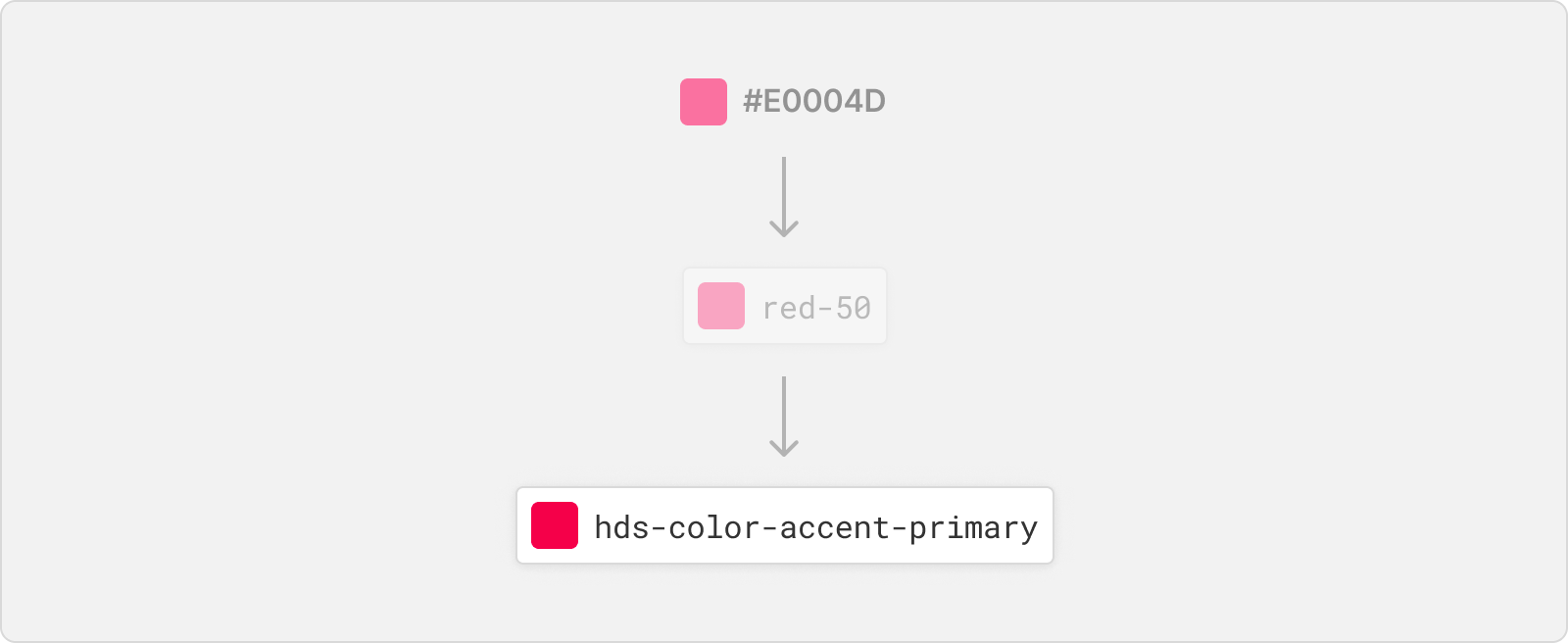
Alias Tokens are design tokens that relate to a specific context or abstraction. These tokens help communicate the intended purpose of a token and are useful when a value with a single intent will appear in multiple places. By defining an alias token, we can simplify our design system and make it easier for designers and developers to understand the purpose and usage of each token.
Component-specific Tokens
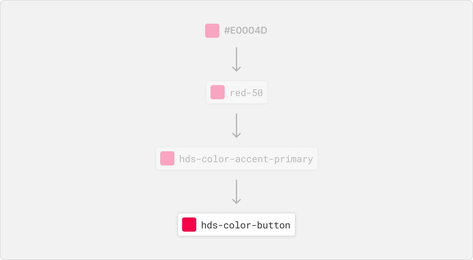
Component-specific Tokens are an exhaustive representation of every value associated with a component. These tokens often inherit from alias tokens but are named in a way that allows engineering teams to be as specific as possible in applying tokens in component development. By defining component-specific tokens, we can ensure that each component in our app adheres to a consistent design system.
Generating Design Tokens
While there are many ways to create design tokens, we'll focus on using a Figma Tokens plugin to generate a JSON file of our design tokens.
Before we begin, it's important to note that creating design tokens is a collaborative effort between designers and developers. Designers define the visual styles and properties of the app, while developers implement the design tokens in in our app design library. By using a Figma plugin to generate design tokens, our designers and developers can work together seamlessly to create a unified design system for the app.
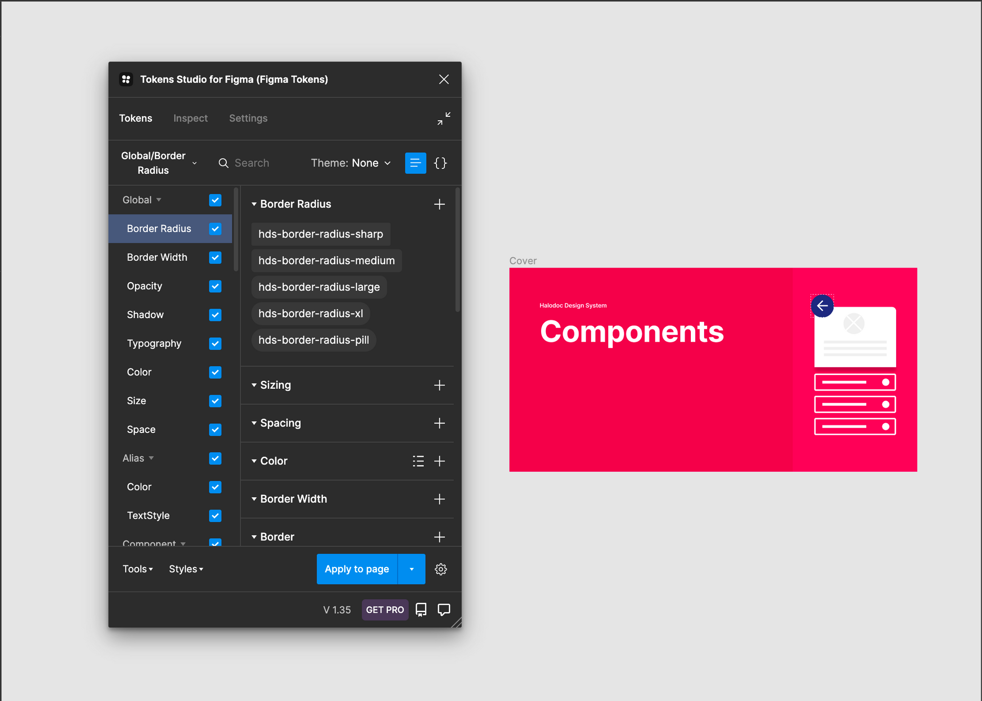
To generate design tokens using the Figma plugin, designers can select the elements they want to export as tokens and then run the plugin. The plugin will extract the relevant design properties from the selected elements and create a JSON file of design tokens.
Generating Tokens
We'll need to create a new project using Style Dictionary. Style Dictionary is a tool that helps generate design tokens in a variety of formats, including Swift, JSON, CSS, SCSS, and more. With Style Dictionary, you can define your design tokens in a single file and generate multiple output files for use in your app.
Step 1: Create Project Style Dictionary
To create a project with Style Dictionary, we can use the command style-dictionary init basic . This will create a basic project structure with a JSON file for defining our design tokens. Then put our generated JSON file from Figma into the "tokens" folder in our project directory. In this case we put sample file hds-token.json. Here is a basic example of what the package structure can look like:
├── config.json
├── tokens/
│   ├── hds-token.json
│   ...
├── build/
Step 2: Generate JSON Transformer
The current JSON file generated from Figma may not be compatible with Style Dictionary. To solve this problem, we need to transform the JSON file to a new format that is compatible with Style Dictionary.
One way to achieve this is by using Token Transformer library to create a new JSON transformer. Before we can use the library, make sure to install it using the following command:
npm install token-transformer --save-devWe can create a new JSON transformer file called "hds-token-transformer.json" using the command:
token-transformer ./tokens/hds-token.json ./tokens/hds-token-transformer.json --resolveReferences=falseThis command takes the figma JSON file and applies a set of rules defined in our JSON transformer file to transform it into a new JSON file called hds-token-transformer.json in the tokens folder that can be used with Style Dictionary.
This is sample file from figma hds-token.json looks like:
{
  "Global/Border Radius": {
    "hds-border-radius-sharp": {
      "value": "2",
      "type": "borderRadius",
      "description": "This is sharp border radius"
    },
    "hds-border-radius-medium": {
      "value": "{hds-border-radius-sharp} * 2",
      "type": "borderRadius",
      "description": "This is default border radius."
    }
  },
  "$themes": [],
  "$metadata": {
    "tokenSetOrder": [
      "Global/Border Radius"
    ]
  }
}
This is file generated from token transformer hds-token-transformer.json looks like:
{
  "hds-border-radius-sharp": {
    "value": 2,
    "type": "borderRadius",
    "description": "This is sharp border radius"
  },
  "hds-border-radius-medium": {
    "value": "{hds-border-radius-sharp} * 2",
    "type": "borderRadius",
    "description": "This is default border radius."
  },
  "tokenSetOrder": {
    "0": {
      "value": "Global/Border Radius",
      "type": "other"
    }
  }
}
Step 3: Create Custom Config
The configuration file is a JSON file that defines how Style Dictionary should generate its output files. It consists of two main sections: Source and Platforms.
{
  "source": ["tokens/hds-token-transformer.json"],
  "platforms": {
      "ios-swift": {
        "transformGroup": "ios-swift",
        "buildPath": "build/ios/",
        "files": [
          {
            "destination": "StyleDictionaryRadius.swift",
            "format": "radius/ios/swift",
            "filter": {
              "type": "borderRadius"
            }
          }]
      }
    }
}
Source section specifies the input files that Style Dictionary will use to generate its output files. In this case, we are pointing to the transformed JSON file that we generated in the previous.
Platforms section defines the specific platforms and formats that we want to generate output files for. In this example, we are targeting the iOS platform with the ios-swift format. We are using the transformGroup property to specify which transformation rules to apply to the design tokens, and the buildPath property to specify where the generated output files should be saved.
Under the files property, we define the specific output files that we want to generate. In this case, we are generating a single file called StyleDictionaryRadius.swift using the radius/ios/swift format. We are also applying a filter to only include tokens of type borderRadius in this output file.
Step 4: Create Extends Style Dictionary
After we have defined the radius/ios/swift format in our config file, we can create a JavaScript file called build.js to extend the functionality of Style Dictionary and generate Swift code. In this file, we require Style Dictionary and register the custom format we defined in the config file.
 // Import Style Dictionary library
const StyleDictionary = require('style-dictionary');

// Define a custom formatter for the iOS Swift platform
StyleDictionary.registerFormat({
  name: 'radius/ios/swift',
  formatter: function({ dictionary }) {
    // Return a Swift file that contains all the borderRadius tokens
    return `import UIKit

public enum StyleDictionaryRadius {
  ${dictionary.allTokens.map(function(token) {
    return `public static let ${token.name} = ${token.value}`;
    // Map all the tokens to Swift properties with the name and value
  }).join('\n  ')}
}`;
  }
});

// Create a new Style Dictionary instance with the custom configuration
const StyleDictionaryExtended = StyleDictionary.extend(__dirname + '/config.json');

// Build all the platforms defined in the config file
StyleDictionaryExtended.buildAllPlatforms();
This code defines a custom formatter for the iOS Swift platform that generates a Swift file with all the borderRadius tokens. Then, it creates a new instance of Style Dictionary with a custom configuration file, and builds all the platforms defined in the configuration file.
node ./build.jsBy running this command, the script will be executed and the StyleDictionaryRadius.swift file will be generated in the build folder. This is the final step in the process of creating custom configuration and generating a file in the desired format. With this file, developers can now easily access the design tokens and use them in their iOS apps.
 import UIKit

public enum StyleDictionaryRadius {
  public static let hdsBorderRadiusSharp = 2
  public static let hdsBorderRadiusMedium = 2 * 2
}
Step 5: Unified Command
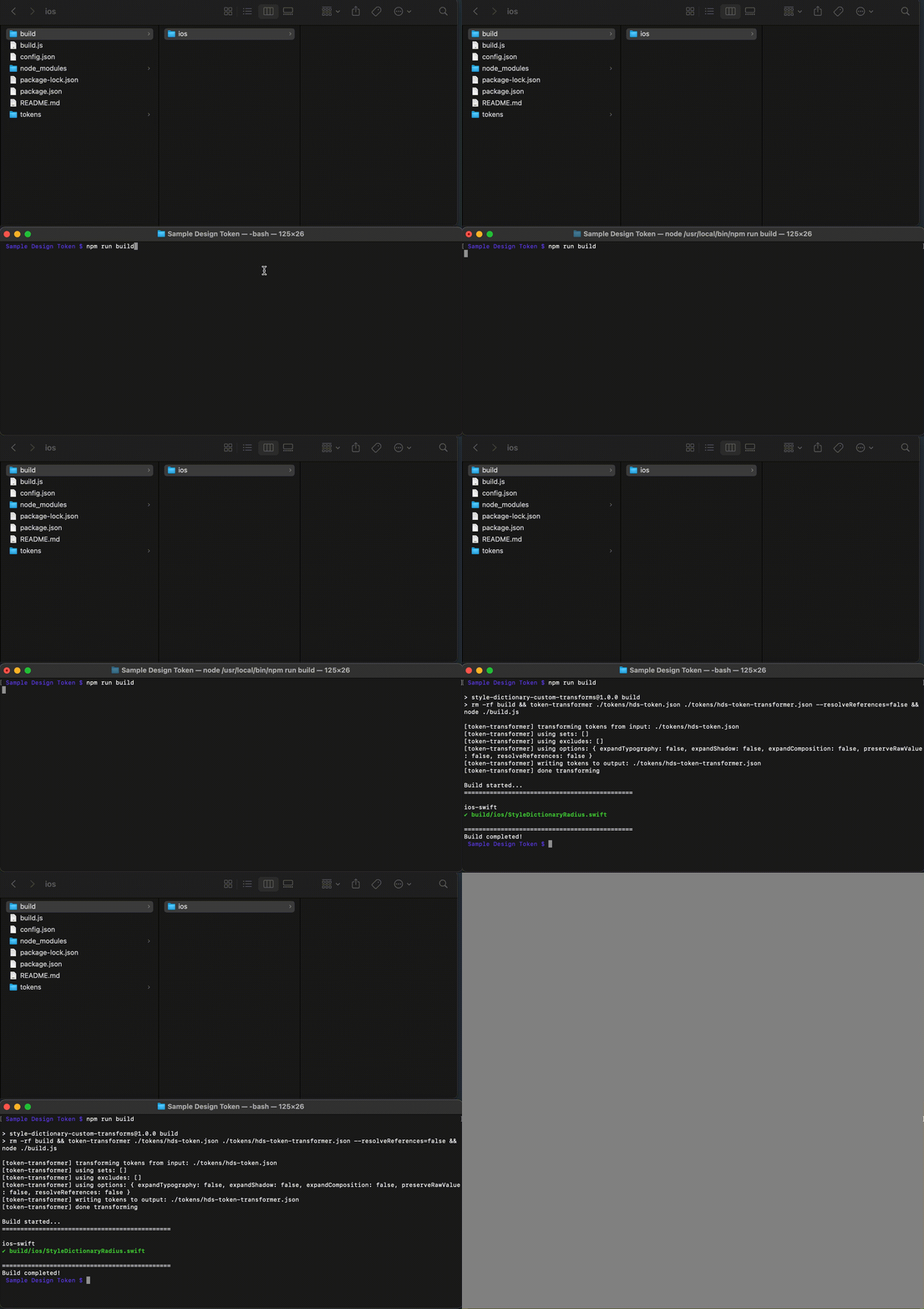
Since we are using npm at beginning, it's convenient to unify all the necessary commands inside the package script. By defining the build script in our package.json file, we can run all the necessary commands with a single npm run build command.
{
  "name": "style-dictionary-custom-transforms",
  "version": "1.0.0",
  "description": "",
  "main": "build/index.js",
  "files": [
    "build",
    "properties"
  ],
  "scripts": {
    "build": "rm -rf build && token-transformer ./tokens/hds-token.json ./tokens/hds-token-transformer.json --resolveReferences=false && node ./build.js",
    "clean": "rm -rf build",
    "test": "echo \"Error: no test specified\" && exit 1"
  },
  "author": "",
  "license": "Apache-2.0",
  "devDependencies": {
    "style-dictionary": "3.7.2",
    "token-transformer": "^0.0.29"
  }
}
As you can see in build scripts above, this script will deletes the previous build folder, transforms our Figma JSON to the Style Dictionary format using token-transformer, and runs our build.js file to generate our Swift code.
Step 6: Done
After following all the steps, you have successfully generated our design tokens using Style Dictionary and put them into our project. Now, you can use these design tokens to create consistent and cohesive designs across your entire product. With this organized system, you can save a lot of time and effort by avoiding manual updates and inconsistencies.
Known Challenge
- One challenge we face when using Style Dictionary to generate design tokens is the process of manually putting the generated files into our project.
To make this process more seamless, we can integrate the token transformer into our GitLab pipeline. This way, the generated files can be automatically added to our project as part of the pipeline process.
Additionally, we can use Jenkins jobs to generate the design token Swift code and put it in our iOS library. This will eliminate the need for manual intervention and streamline the process even further.
By implementing these changes, we can reduce the time and effort required to update design tokens and ensure that they are always up to date and accessible in our projects.
Conclusion
Design tokens are an essential aspect of modern design systems that can significantly improve the consistency, efficiency, and scalability of product design and development. At Halodoc, we understand the importance of design tokens and invest in creating a seamless process for our designers and developers to work together effectively. By using tools like Figma, Token Transformer, and Style Dictionary, we can generate design tokens that are easy to manage, share, and integrate into our projects.
Moreover, by using GitLab integration and Jenkins job, we can automate the process of generating design token Swift files and putting them into our iOS library, which saves us time and effort while ensuring consistency across our products. At Halodoc, we are committed to creating outstanding digital products that meet our users' needs and exceed their expectations.
Join us
Scalability, reliability, and maintainability are the three pillars that govern what we build at Halodoc Tech. We are actively looking for engineers at all levels and if solving hard problems with challenging requirements is your forte, please reach out to us with your resumé at careers.india@halodoc.com.
About Halodoc
Halodoc is the number 1 all-around Healthcare application in Indonesia. Our mission is to simplify and bring quality healthcare across Indonesia, from Sabang to Merauke. We connect 20,000+ doctors with patients in need through our Tele-consultation service. We partner with 3500+ pharmacies in 100+ cities to bring medicine to your doorstep. We've also partnered with Indonesia's largest lab provider to provide lab home services, and to top it off we have recently launched a premium appointment service that partners with 500+ hospitals that allow patients to book a doctor appointment inside our application. We are extremely fortunate to be trusted by our investors, such as the Bill & Melinda Gates Foundation, Singtel, UOB Ventures, Allianz, GoJek, Astra, Temasek, and many more. We recently closed our Series C round and In total have raised around USD$180 million for our mission. Our team works tirelessly to make sure that we create the best healthcare solution personalised for all of our patient's needs, and are continuously on a path to simplifying healthcare for Indonesia.

