
Faster and Consistent Mobile App UI Design using Common Design Principles/Common UI Components
Architecture plays a major role in any system for various reasons. Here at Halodoc, we are constantly working to improve and optimise our iOS application. We use a common design principle of creating a generic UI component, which enables our multiple teams to build the UI faster and consistently throughout the application. We want developers to be productive and work less on repetitive tasks. That includes a range from basic to highly advanced components.
Why is Design Consistency Important?
The consistent approach to user experience design leads to the following benefits:
- The ramp-up time is less for the new developers. The manual error also comes down.
- It reduces cognitive load this way, saving users’ time and effort
- Consistency supports a strong brand image for a website or application
We will discuss some components that help us to reduce the development time and are easily configurable.
UIKit
The components are created on top of UIKit , which is native framework for UI element in iOS. To create a custom component on top of UIKit, you will need to subclass a UIKit view or view controller and add your desired behaviour and appearance. For example, if you want to create a custom button that has a different background Color and rounded corners, you could subclass UIButton and override the draw(_:) method to draw the button with the desired appearance.
UIKit is a powerful tool for creating common, consistent, reusable components for iOS app. By leveraging the built-in UI elements provided by UIKit, you can create custom components that are visually appealing and easy to use, helping you create a great app that your users will love.
Customised UIButton
It is created on top of the UIButton. We use this generic template across all our modules.
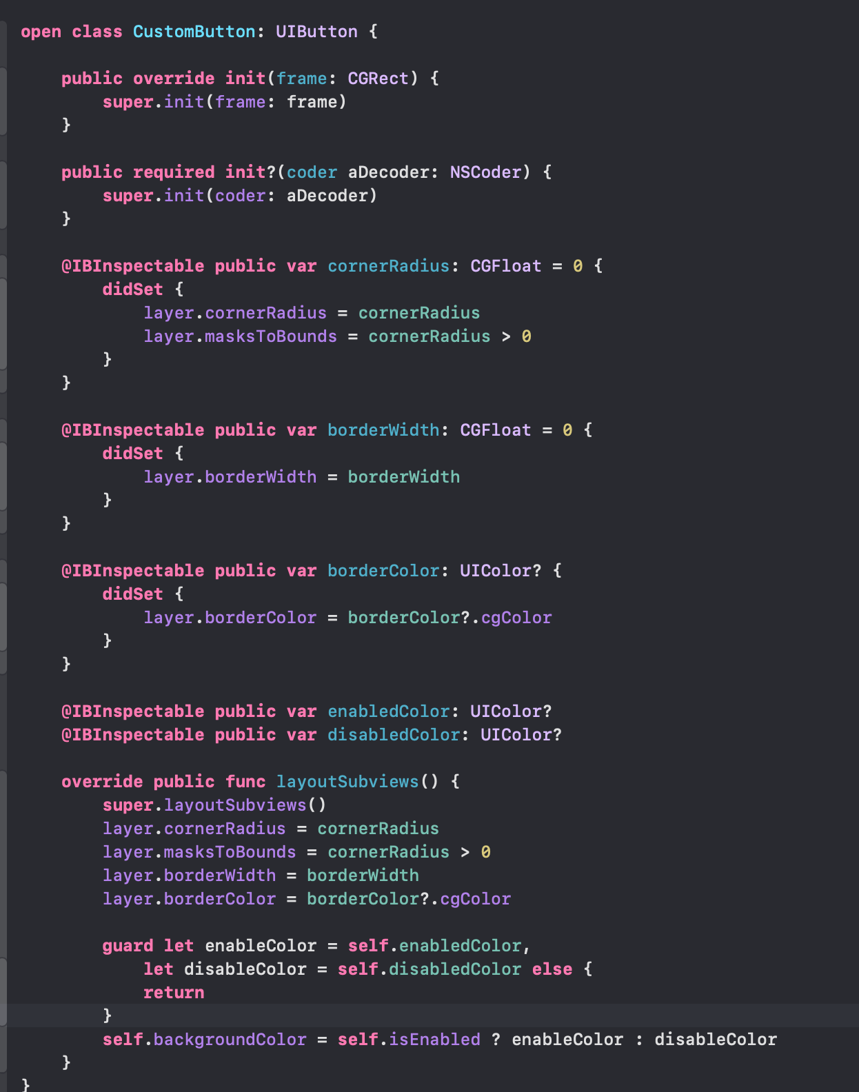
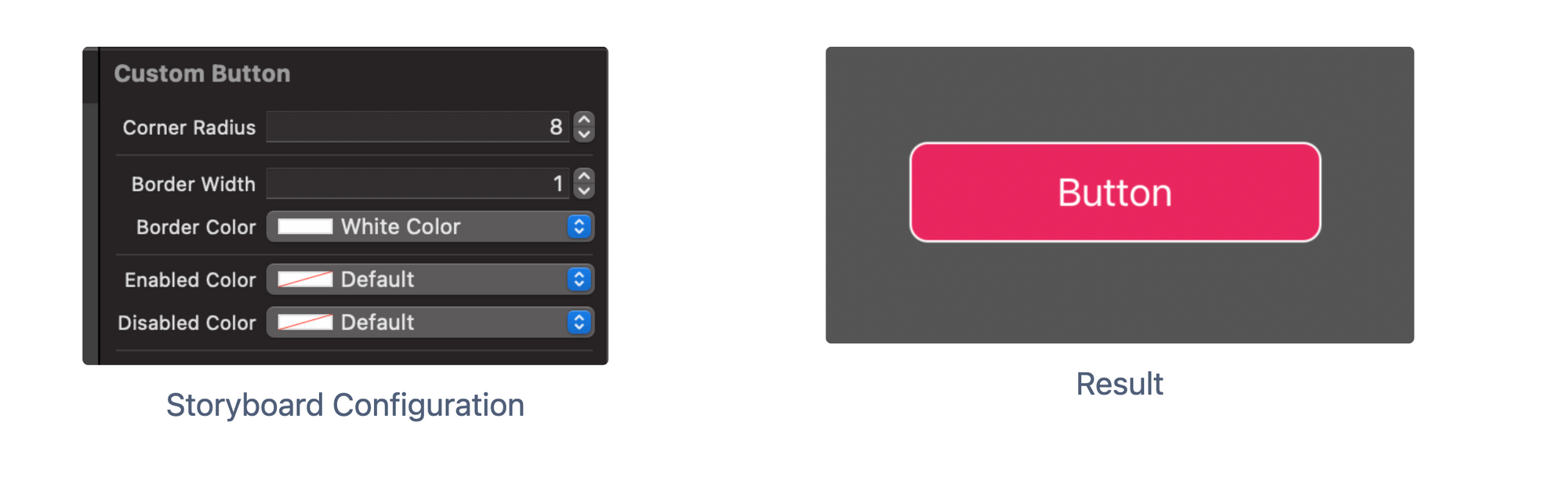
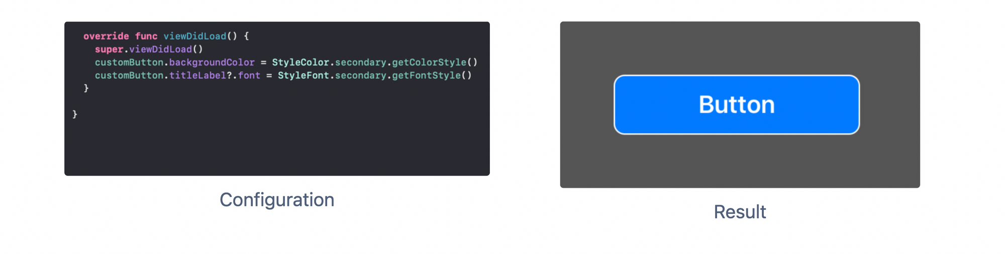
We have created a button instance using a storyboard. We assigned the button class as CustomButton with the following configuration.
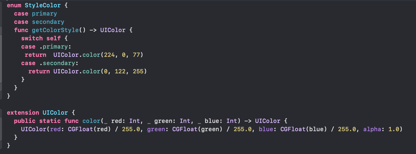
This will be the enum for styling the Color. This will consistently be used across the modules. If there is any update in Color, we will quickly do it at this central place.
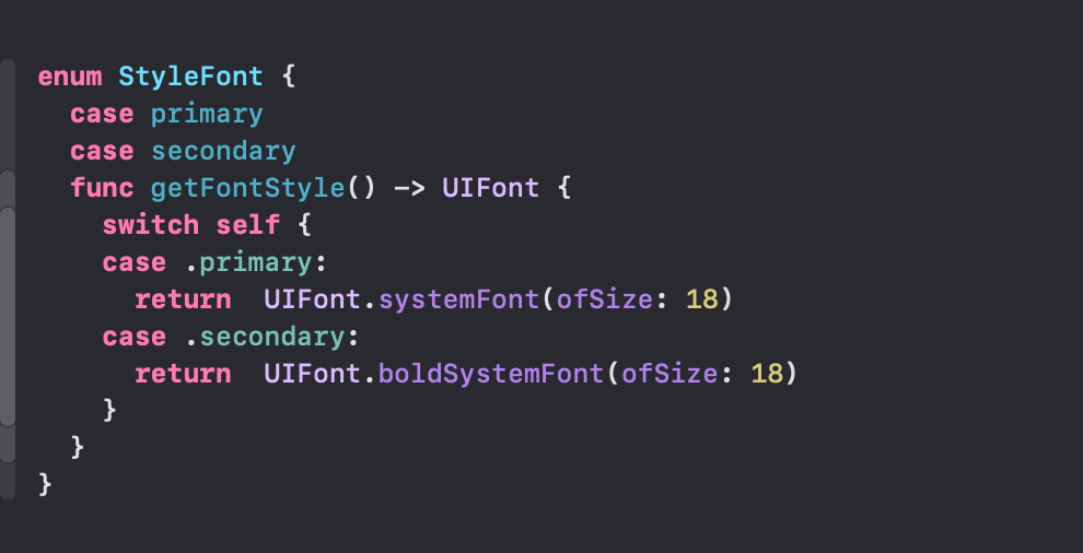
This will be the enum for styling the Font. This will consistently be used across the modules. In practice, We are going to define our custom Font.
Changes as per secondary Font and secondary Color
Similarly, we can set various styles for this component to match our design with state, animations, shadow and many more. Just try to segregate those styles as separate components. That way, you would have more control over them.
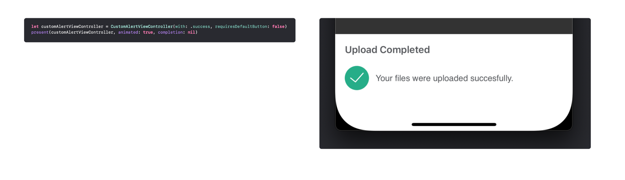
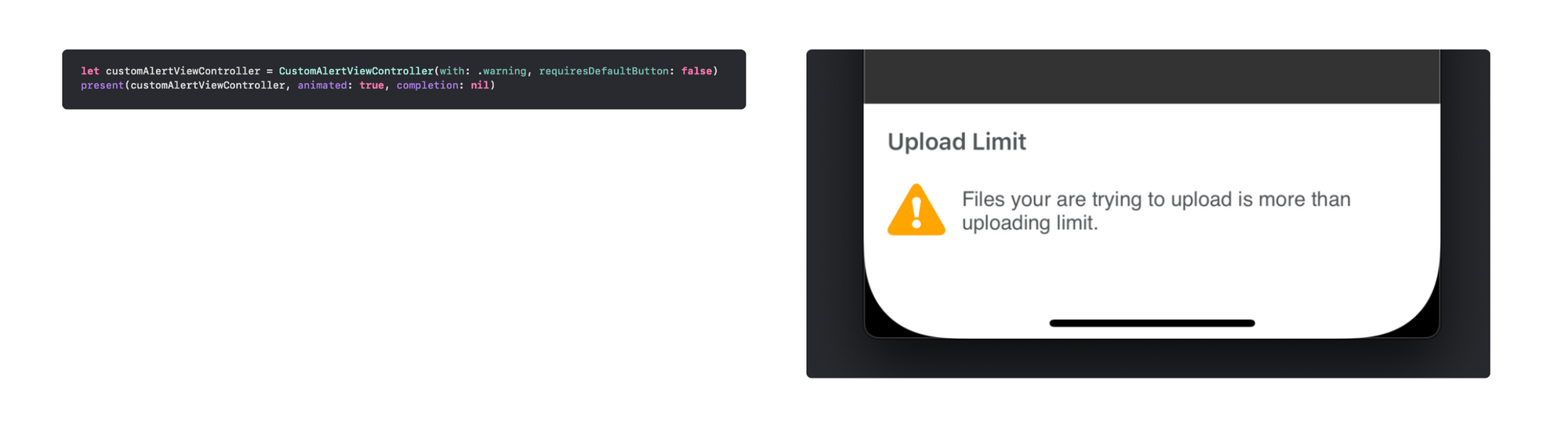
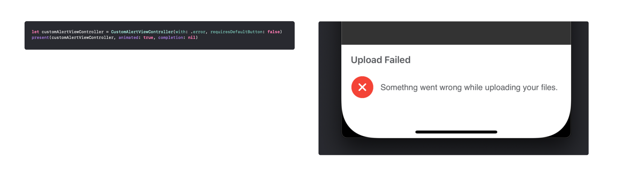
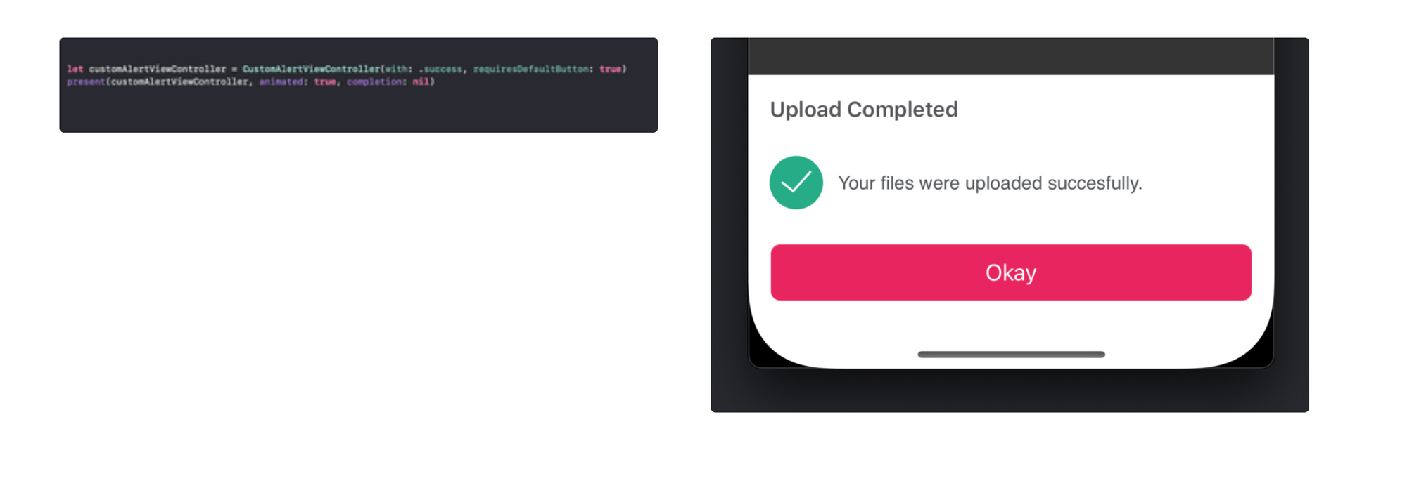
Customised AlertView
We often need to display the alert to display some meaningful information about something critical or important. The idea of having a generic component for this purpose is helping us at many levels. Developers can easily use this common component and configure it as required. It will save time and enable us to update the alert design quickly.
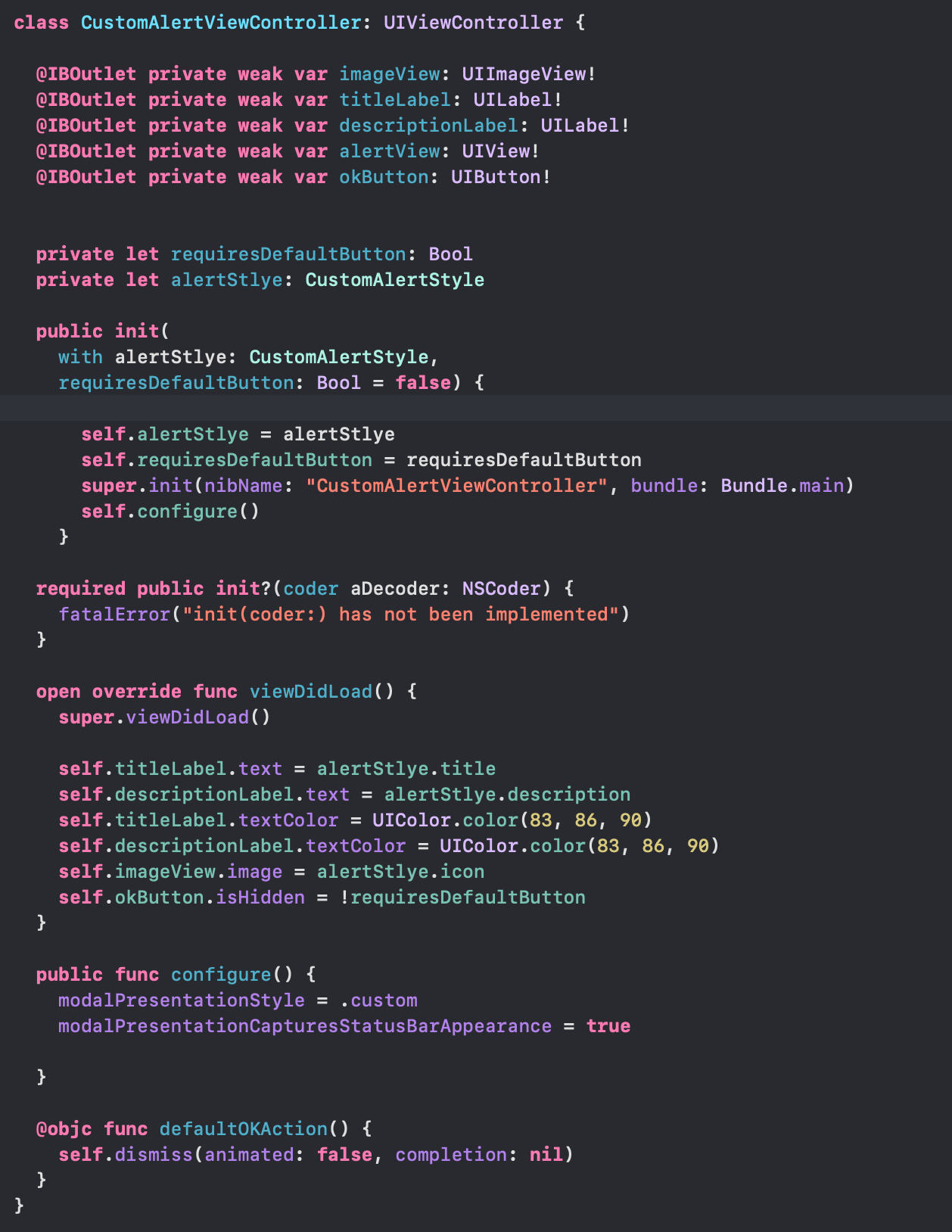
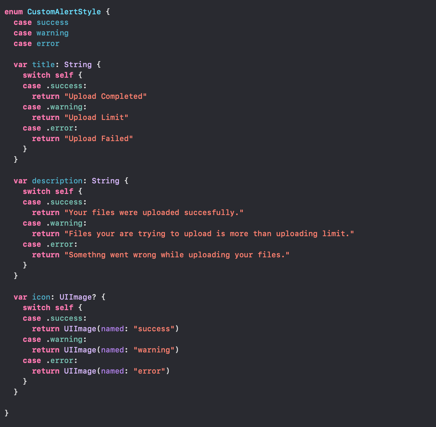
I have created the CustomAlertStyle for various alert states like errors, warnings and success with three properties.
- title
- description
- icon
Now that we have three states, we can have as many as we want as required. We need to pass this state into our customAlert initialiser.
We are passing a flag to configure the Okay button. We can communicate with this button via delegate or closure. The action will depend on the client who is consuming the component.
For scalability, we can break down the UI into smaller independent components to create reusable UI components for other components. Like custom CollectionViewCell, TableviewCell, Picker, Bottomsheet, or Calendar. Isolated components are much easier to test. Updating the independent component will update it everywhere.
The same concept is applicable for Android also using AndroidX, which has helped in driving a consistent look & feel and faster development of the app.
Conclusion
The above examples give us an opportunity to develop generic and reusable UI components that enable our developers to create quicker and more consistent interfaces across the modules. This also enables us to quickly update the alert design in case UX Team decides to update the design all over the application, which is very common in growing startups. Having a separate framework is the bonus that makes it reusable in other applications if needed. Also, isolation makes them easily testable.
Join us
Scalability, reliability, and maintainability are the three pillars that govern what we build at Halodoc Tech. We are actively looking for engineers at all levels and if solving hard problems with challenging requirements is your forte, please reach out to us with your resumé at careers.india@halodoc.com.
About Halodoc
Halodoc is the number 1 all around Healthcare application in Indonesia. Our mission is to simplify and bring quality healthcare across Indonesia, from Sabang to Merauke. We connect 20,000+ doctors with patients in need through our Tele-consultation service. We partner with 3500+ pharmacies in 100+ cities to bring medicine to your doorstep. We've also partnered with Indonesia's largest lab provider to provide lab home services, and to top it off we have recently launched a premium appointment service that partners with 500+ hospitals that allow patients to book a doctor appointment inside our application. We are extremely fortunate to be trusted by our investors, such as the Bill & Melinda Gates Foundation, Singtel, UOB Ventures, Allianz, GoJek, Astra, Temasek and many more. We recently closed our Series C round and In total have raised around USD$180 million for our mission. Our team works tirelessly to make sure that we create the best healthcare solution personalised for all of our patient's needs, and are continuously on a path to simplify healthcare for Indonesia.