
Using Design tokens for providing consistent User experiences
In a tech company, the design and development flow of its digital product usually starts with designers spending days making the desired visual of their digital product, it can be a website or a mobile app. The next step is for developers to spend the same amount of time, or maybe more, to process the visual given by designers into codes.
In recent times, more tech companies realize that this flow might not be the most efficient way of working. For example, let's say that a tech company wants to have a rebranding by changing the color of the buttons across all their products. At a glance, this task might look easy enough. But imagine if these buttons are placed across multiple screens or pages of the product, and the company has not even implemented a design system. What started as a "simple color change" task, might turn into a task that needs a few weeks to be completed.
At Halodoc, we are always looking at ways to make our workflow more efficient. That is why we are implementing a design system at the start of this year, and more recently we have started implementing design tokens on top of this design system.
What are Design Tokens?
Design tokens are a crucial part of any design system. They are the building blocks that allow teams to create and maintain a consistent visual language across their products. Design tokens not only help the work of designers but also the work of the product & developer teams.
Design tokens are self-explanatory named entities that store visual design attributes. These visual design attributes can be a hex value for color, a pixel value for spacing, or even a font-family for typography. We use them in place of static or hard-coded values to ensure a consistent look and feel, making it easier to update and maintain their design.
Design tokens are usually stored in a central repository. And because of this, we can easily update the values of a design token and have that change reflected across all of our products. Furthermore, this means that we can deliver design change tasks at a much faster pace.
One of the benefits of using the Design tokens is the ability to translate the information inside the Design tokens itself into multiple technologies or platforms, from web apps to native mobile apps.
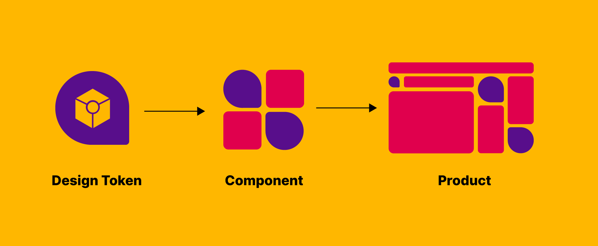
Moreover, Design Tokens are sometimes referred to as a sub-atom in a design system, which is in line with Halodoc's atomic design system approach.
Halodoc's Design Tokens Principals
For our Design tokens approach, we are taking inspiration from Adobe's Spectrum design system. From this, we are modifying several aspects of their Design tokens approach, based on our design system requirements and needs.
Design Token Types
Halodoc's Design token has three types, global, alias, and component-specific tokens.
Global tokens are the most general type of tokens, and they represent the core design values that are used across an entire design system. In our case, our color palette, sizing, and other general values (border-radius, opacity, shadow, etc.) are considered global tokens. These can be used directly, and are usually inherited by all other token types.
Alias tokens are variations of global tokens that are used in specific contexts. Aliases help communicate the intended purpose of a token more clearly and are effective when a value with a specific context will appear in multiple places.
Component-specific tokens, on the other hand, are tokens that are specific to a particular component or module in the design system, and they are used to define the visual appearance of that component. These tokens inherit from alias tokens but are named in a way that allows developers to be as specific as possible in applying tokens in the process of component development.
Size Tokens Auto Scaling
Size tokens, which are part of our global tokens, are used for specifying the sizing and spacing of each of our components. At Halodoc, our web-apps support two platforms: desktop and mobile. For each platform, our components have different size scaling, and components on the mobile scale need to be bigger than the desktop scale.
To make our size tokens compatible with both of these platforms, we are using the rem unit for the value of these size tokens. In CSS, a rem unit is a relative unit of measurement that is based on the root element, which is typically the <html> element. The rem unit is short for "root-em" and it represents the font size of the root element. The advantage of using the rem unit is that it makes it easier to scale size-related values of an entire project, as changing the font size of the root element will automatically change the size-related values of all elements that use the rem unit.
This is what we are also doing with our Design token approach. We are using two different base sizes for desktop and mobile. For the mobile scale, the base size is 10px, and for the desktop scale, the base size is 8px. We are changing the base size in the root HTML of our projects based on the screen size using the media query.
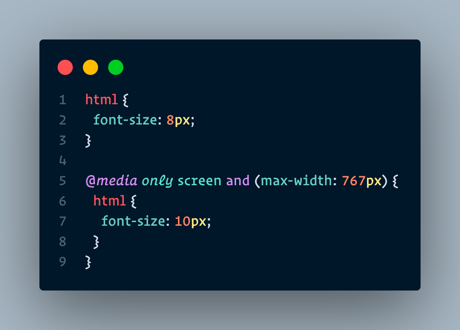
As we see on the root HTML SCSS snippet above, by default the font-size value is 8px (desktop scale), but whenever the screen width size is below 767px the font-size value will adjust to 10px (mobile scale). This way, any elements that use the size token from our Design Token will automatically adjust their size based on the platform.
Implementing Design Token at Halodoc
At Halodoc, the implementation of this Design Token approach is a collaborative effort between designers and developers. Firstly, we are implementing the Design Token approach starting with our web apps. We are building our Design Token as an internal npm library, called @hd-base/design-tokens. This library can be used across all of our web projects.
When building this library, we are using three dependencies:
Figma Tokens + Token-Transformer
At Halodoc, our designers use Figma as their daily tool to create designs and visuals. Figma Tokens is a Figma plugin used to generate the Design Token as a JSON file.
On top of this, developers will then process the generated JSON file using a library called token-transformer, which is an npm library created by the author of Figma Tokens themselves, that will transform or parse the JSON file from Figma Tokens so that it will be compatible to be processed by the next dependencies, style-dictionary.
Style-Dictionary
Style-dictionary is a library for managing design tokens in a consistent and organized way. Style-dictionary takes Design Tokens in the form of JSON file as input and transforms the Design Tokens into platform-specific codes. This might include web, Android, or iOS.
One thing that we learn from using style-dictionary is that it is a very versatile library. We can configure almost any aspect of the transformation process through a config file. This includes configuring the format and the number of the output files, configuring the parsing process of the input JSON file, to even configuring the format of the variable names and the content of the output file.
In Halodoc's case, we are transforming our Design tokens JSON file into SCSS files, consisting of SCSS variables & mixins. These SCSS files will then be imported and used in our components and projects.
The Workflow
From a high-level perspective, here we provide the workflow diagram of Halodoc's Design Token implementation that we have explained above.
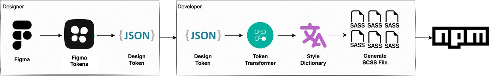
In short, from the designer's side, they will use Figma and Figma Tokens plugin to work on the design tokens and generate the JSON file, while from the developer's side, they will process the JSON file with token-transformer and style-dictionary to generate the global, alias, and component-specific SCSS files. When all is done, developers will publish these SCSS files into an npm library.
SCSS Generation Process
File Structure
Here we take a look at our design tokens library's file structure. We are simplifying the file structure for better readability for this article.
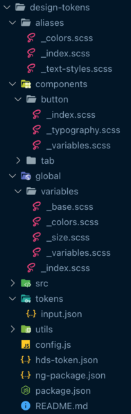
hds-token.jsonis the design token file generated by the designers through Figma Tokens. Any token value changes by the designers will be made in this file.tokens/input.jsonis the output that is generated by executing the token-transformer library to thehds-token.json. This is the file that will be used by style-dictionary to generate SCSS files.config.jsis the config file required by style-dictionary. In this file, we determine which design token JSON file to use, and what is the build path for the output files. Moreover, this file also includes multiple transform & filter functions, which will determine how many output files will be generated and determine which variables are inside each output file.- The
alias,global, andcomponentsfolders are the destination folders for the style-dictionary SCSS generation process. We are separating the SCSS files generated into each of these folders based on the token types that we mentioned above. We determined the names of the SCSS files and also their content, based on the variable types of the token. For the file_colors.scssinside theglobalfolder, for example, consists of our color palette variables meant to be used globally. Another example, is for the file_typography.scssinside thecomponents/buttonfolder consists of variables and mixins meant to be used exclusively for our design system'sButtoncomponent. _index.scssfiles inside thealias,global, andcomponentsfolders consist of@forwardof SCSS files inside each of the folders. These_index.scssfiles will be the entry point to the design-tokens styles when the library is used in other projects.
Design Tokens JSON File
As mentioned above, our designers generate the design token file from Figma Tokens in JSON format. We are naming this file hds-token.json. This design token file consists of sets. Below we provide a snippet from the token file.
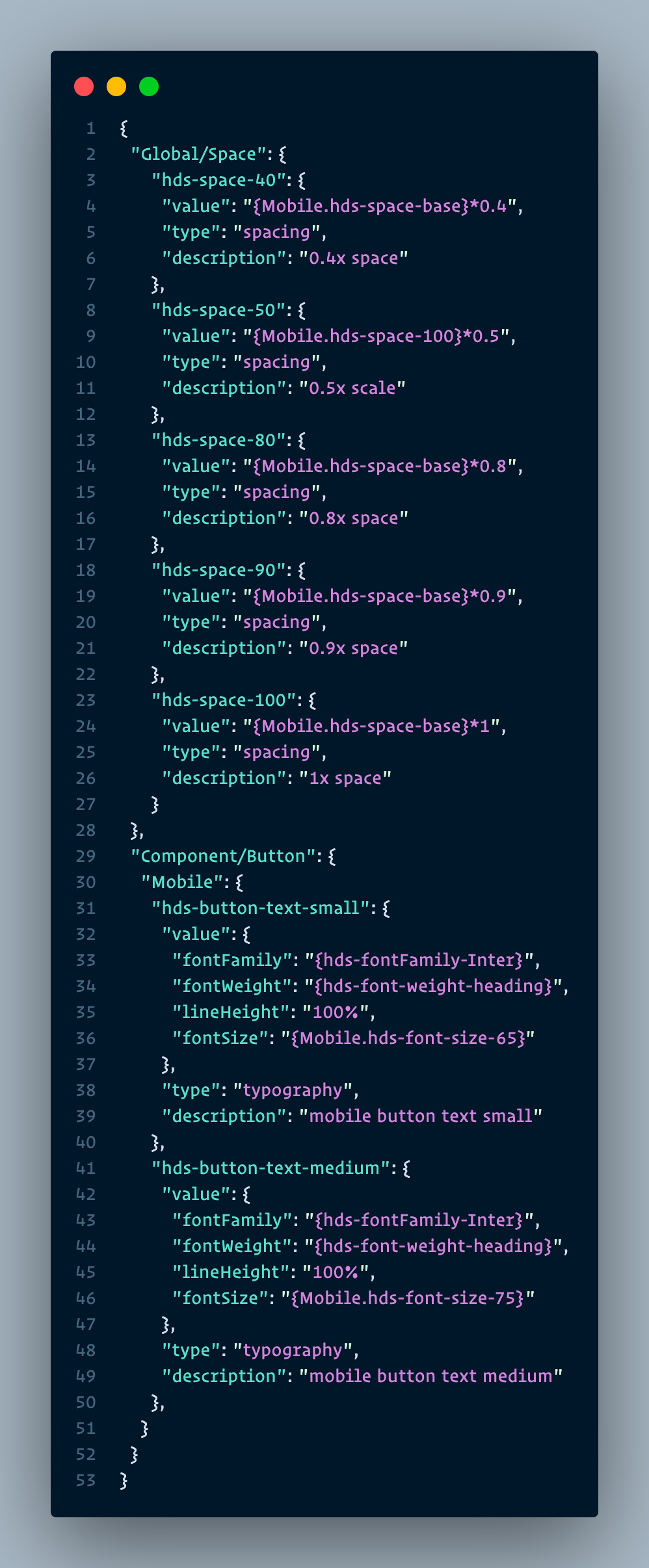
In this snippet, the sets provided are Global/Space & Component/Button. Under the Global/Space set, we have variables related to the spacing attributes, where we consider these as global tokens. These global tokens have the name of the variables as their property names, consisting of an object with value, type, and description properties. Under the Component/Button we have variables that are specific to the Button component in our design system, hence making these variables considered component-specific tokens. If we take a look closer, the type of variables under this set is typography. Typography type variables are special variables that have multiple SCSS properties as their values, in this case, font-family, font-weight, line-height, and font-size.
However, the token format with sets cannot be processed by the style-dictionary directly. This is why we need the token-transformer library to transform the format of the token first so that it will be compatible with the style-dictionary. In detail, the token-transformer will remove all those parent set key names on the JSON.
Component-Specific Token Naming Convention
To avoid confusion and to have a set of rules and standardization, our designers and developers have agreed on a naming convention for component-specific tokens:
hds-{component_name or alias_name}-{property}-{variation}hdsis a mandatory prefix, which is short forHalodoc Design Systemcomponent_nameoralias_name. To determine which components will use the token, for example,button,radio_button,tab; or to use as the alias for global tokens, for example,accent,body,heading.propertyis to determine the type of styling that the token will offer, for example,color,text, andspacing.variationis to determine the variation name of the components themselves.- All fields will use snake case whenever it has more than one word.
SCSS Output File
We have made configurations in the config file of style-dictionary so that the output files that are generated by it are SCSS files consisting of SCSS variables. We have also made configurations so that the tokens under the Global/Space set will be populated in a file called _size.scss under the global token folder. Below is the generated SCSS file from the Global/Space token set in the snippet above.
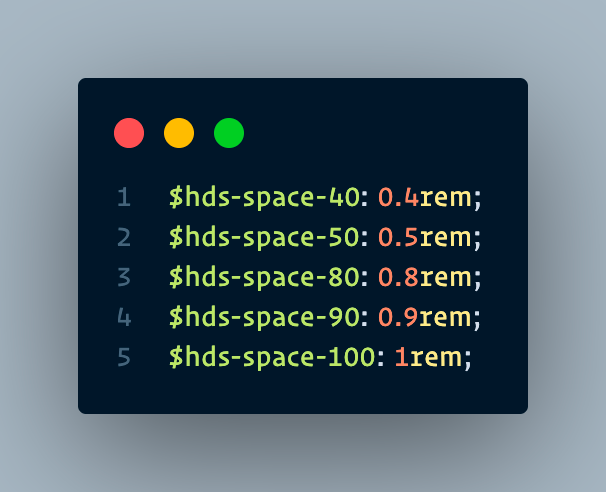
As we see above and mentioned before, we are using the rem unit for our size-related tokens. We acquired these rem values from the multipliers of the value property of each token.
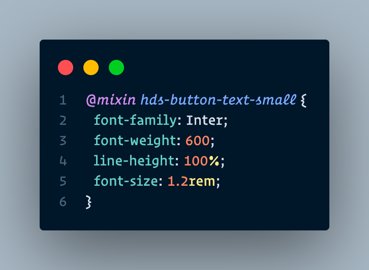
As for typography tokens, we have made a transform function in the config file of style-dictionary, to convert them into mixins. These mixins will be generated in their SCSS file for each component, called _typography.scss. Here's the example of the mixin generated from the Component/Button token set from the snippet above.
Project Implementation Process
Finally, after all the processes above, we are now ready to implement the Design Token npm library for our projects. In this example, we are implementing this library for our design system project. Here are the steps:
- Install the
@hd-base/design-tokensnpm library. - Set the base sizes with a media query on your project's root HTML file (as explained above).
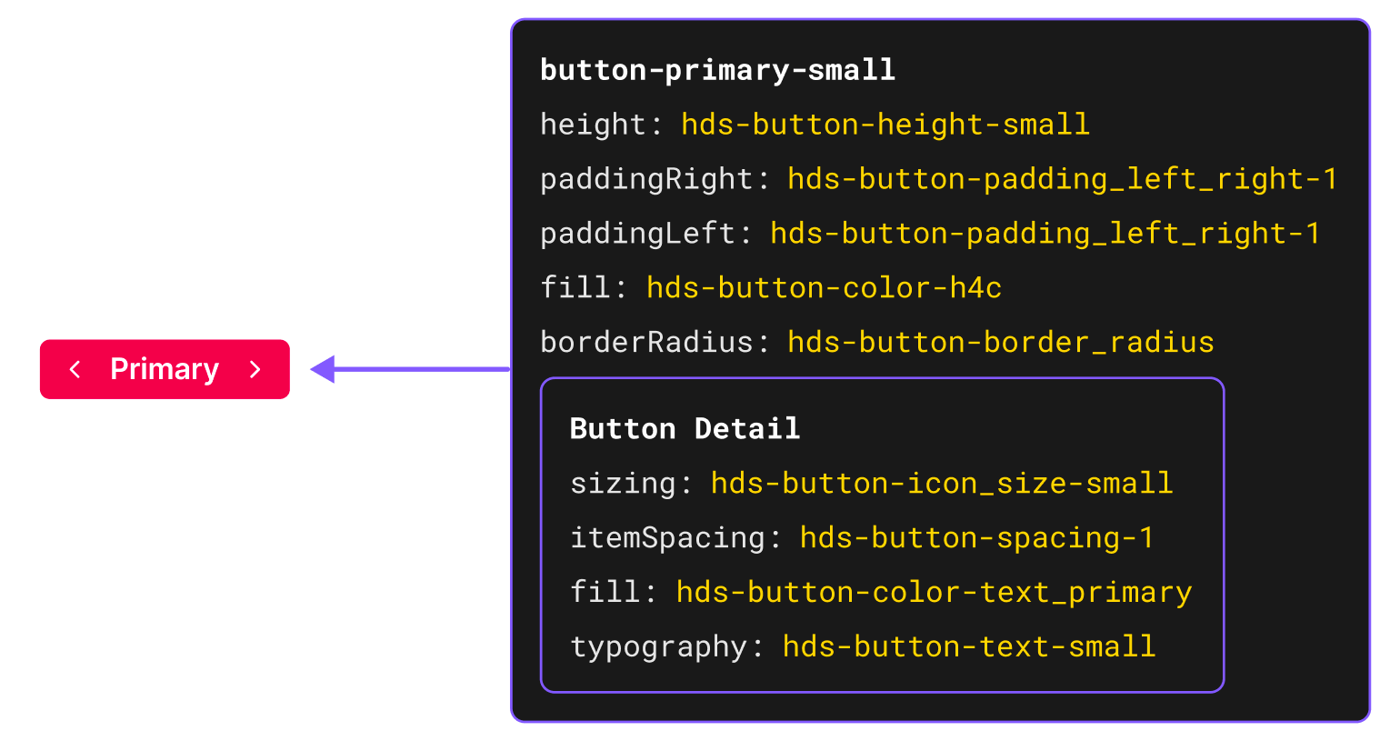
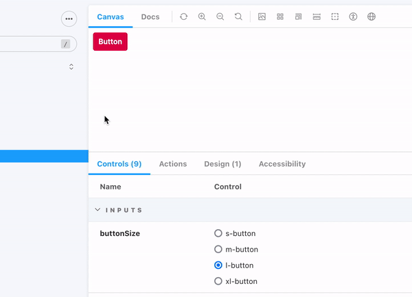
- Go through the Figma design token documentation for each component created by designers. Designers will determine which token variables are needed for every styling property of the component. Here's an example of the documentation for our
Buttoncomponent.
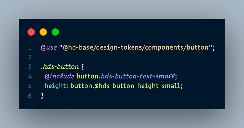
- On the SCSS file of our
Buttoncomponent, we can import the required variables with@use. For example, we want to implement the tokens forheightandtypographyproperties. Both of the required tokens are available in the component-specific SCSS of theButtoncomponent, so we are importing from there. As a reminder, the typography token results in a mixin, so we are implementing it with@include. The implementation should look like this:
In the video below, we can see the result of implementing the above design token variables into the SCSS file of the Button component from our design system in Storybook.
As we can see above, our button component's size is adjusting itself, based on the screen width (desktop scale and mobile scale). This means that the base size change in the root HTML file of our Storybook is successful. And because our height token and font-size token inside the mixin use rem unit, the height and font size of the button also change.
Summary
Design tokens are an important concept in a design system. They are the sub-atomic units of a design system, representing the design's visual language in code. This allows designers and developers to work with a common language and easily make global changes to the design of a product. Design tokens can be used to represent a wide range of design attributes, including colors, typography, spacing, and more. With design tokens, teams can create a consistent, scalable, and maintainable design for their product.
Join us
Scalability, reliability, and maintainability are the three pillars that govern what we build at Halodoc Tech. We are actively looking for engineers at all levels and if solving hard problems with challenging requirements is your forte, please reach out to us with your resumé at careers.india@halodoc.com
About Halodoc
Halodoc is the number 1 all around Healthcare application in Indonesia. Our mission is to simplify and bring quality healthcare across Indonesia, from Sabang to Merauke. We connect 20,000+ doctors with patients in need through our Tele-consultation service. We partner with 3500+ pharmacies in 100+ cities to bring medicine to your doorstep. We've also partnered with Indonesia's largest lab provider to provide lab home services, and to top it off we have recently launched a premium appointment service that partners with 500+ hospitals that allow patients to book a doctor appointment inside our application. We are extremely fortunate to be trusted by our investors, such as the Bill & Melinda Gates Foundation, Singtel, UOB Ventures, Allianz, GoJek, Astra, Temasek, and many more. We recently closed our Series C round and In total have raised around USD$180 million for our mission. Our team works tirelessly to make sure that we create the best healthcare solution personalized for all of our patient's needs, and are continuously on a path to simplify healthcare for Indonesia.