

Creating Animations with Angular Animations
In the world of web applications, animation provides users with the illusion of motion. While behind the curtain, the animation is only styling changes that happen over time, from its initial to its final state, on HTML elements.
Animations in web applications have been around since the early days of the internet. However, in this time of age where web applications are the main source of information and tools for people in everyday life, animations are an important and integral part when building a web application.
While properly placed and well-timed animations can make our web application look better and more modern, they aren't there just for cosmetic purposes. Movements can make people pay attention. Animation can make users focus their attention on whatever important messages we want to convey to them through our app. Animation can provide users with a satisfying and fluid feeling, while also giving them feedback on their actions, and this keeps them engaged when using our app. It can be as simple as a spinning loader or a more complicated one like the fade-in effect when users scroll the page. In short, animations can increase our app's overall user experience.
On the contrary, too many animations can also make you lose your app's users. Animations should not be overly complicated and mistimed. And more importantly, they should not be an annoyance or a turn-off for your users. Therefore it is a good thing to do UI/UX research for your app when needed.
Angular Animations
Angular Animations (@angular/animations) is a module that is part of Angular itself, and it is built based on CSS functionality. This means all the functionalities that are possible in CSS animations are also possible to do with this module, including transforms, scales, colors, etc.
However, Angular Animations provides users with a better way of controlling or arranging animations. With this module, we can define animation sequences for elements as multiple transformations that occurred over some time. These animations can happen sequentially or in parallel. In terms of performance, Angular Animations is similar to CSS animations. Moreover, with Angular Animations, we can create animations directly without the need of installing third-party or external dependencies.
All of these are some of the many reasons that we think why Angular Animations is a great module to start adding animations to your web application.
Setup
Before we start using Angular Animations, we need to do a few steps to set it up.
First, we have to verify that the @angular/animations package is already installed and listed on the dependencies part of your package.json file. Although when you create your project using the CLI, this package should be installed by default.
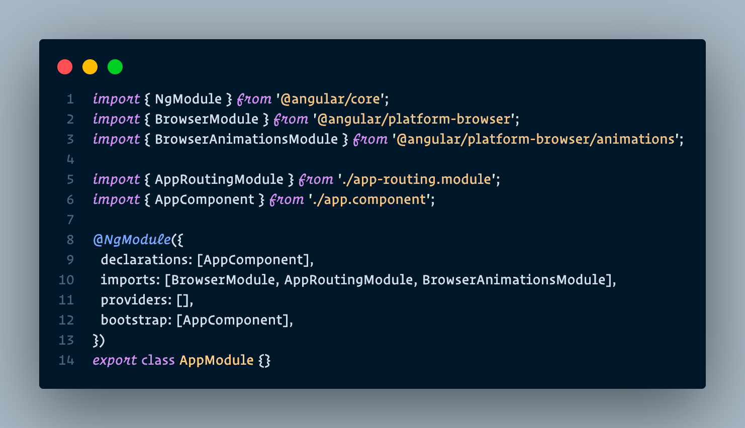
Second, we need to import BrowserAnimationsModule from @angular/platform-browser/animations and include it into the imports array of the root module file. See the snippet below.
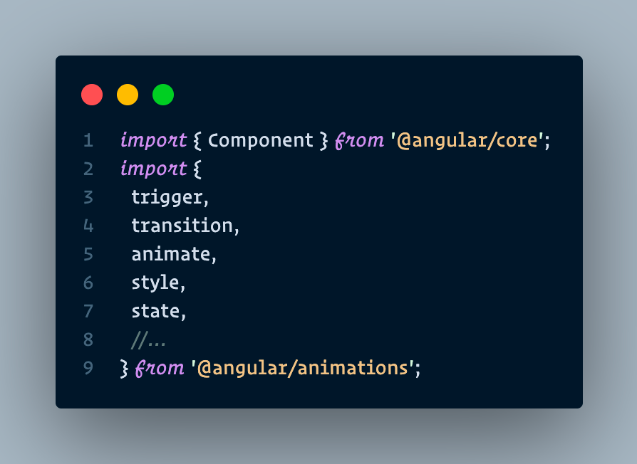
Third, if we want to give animations to a certain component, we need to import the animation functions that we want in that component's file. These functions are imported from @angular/animations. See the snippet below.
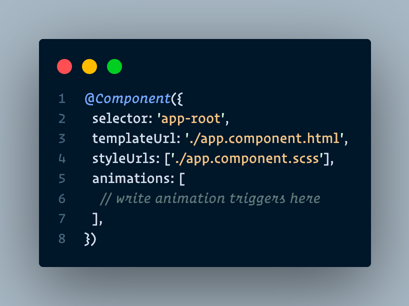
Finally, in the same component file, we need to include the metadata property animations: [] in its @Component() decorator. Each of the array elements in this property represents an animation trigger. See the snippet below.
And now we are all set to start creating animations!
Creating a Simple Animation
State and Style
To define a state for the animation, we need to use Angular Animations state() function. This function has two arguments. The first one is the state name. Angular provides us with three options that we can use:
voidstate. This state is for when the element is not yet part of the DOM, or when it is removed from the DOM.wildcard (*)state. This state is the default state of the element. In defining transition, this state also means any state.- Custom state. This state can be any custom name that we defined on the code.
The second one is the style() function. We use the style() function to determine a set of CSS styles to associate with the state name.
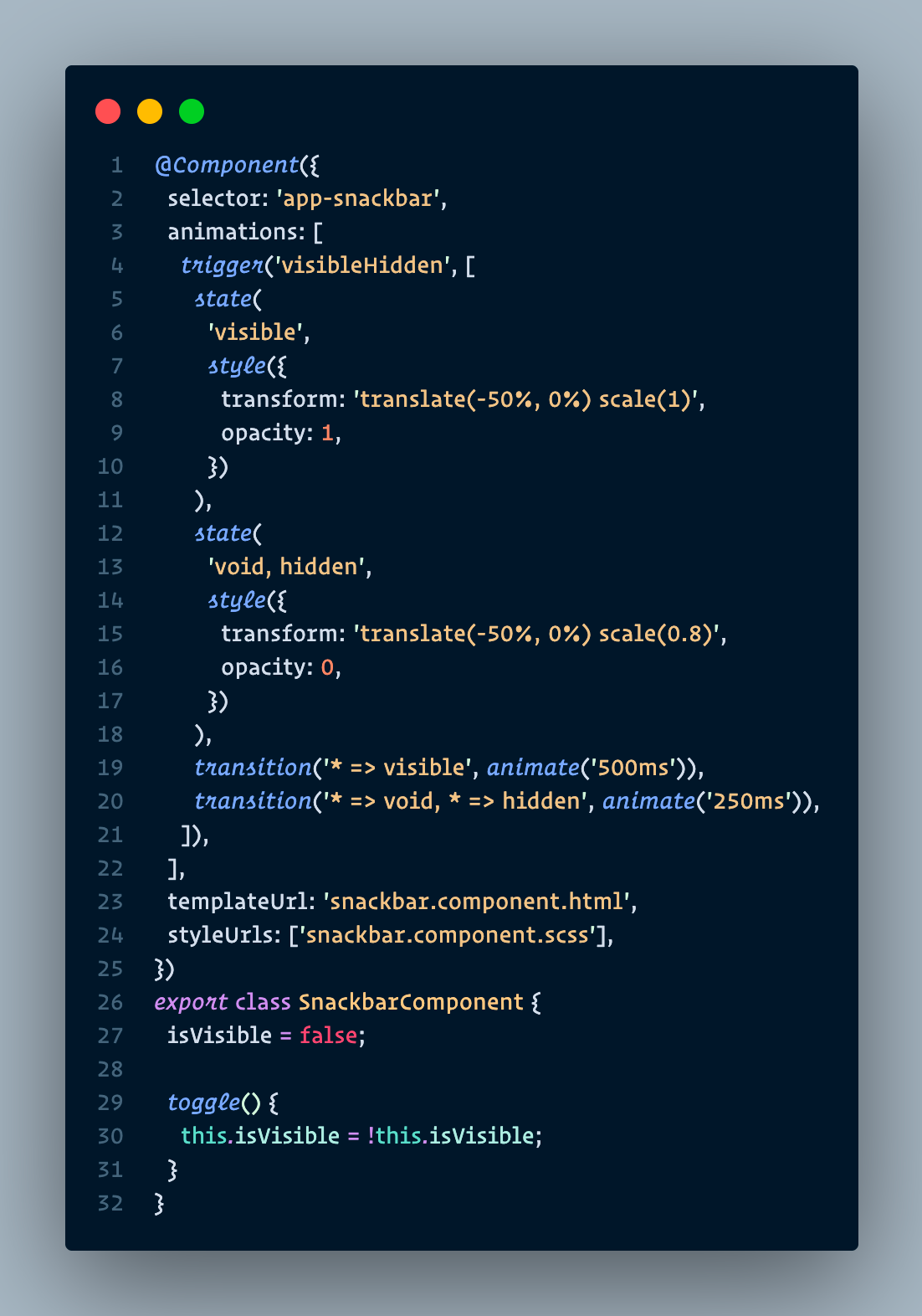
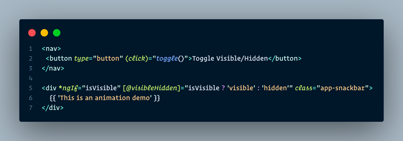
For this article, we are going to demonstrate creating a simple animation using Angular Animations by creating a snackbar component. With a click of a button, this snackbar will appear with a fade-in and expanding animation and will disappear with a fade-out and shrinking animation when the button is clicked again.
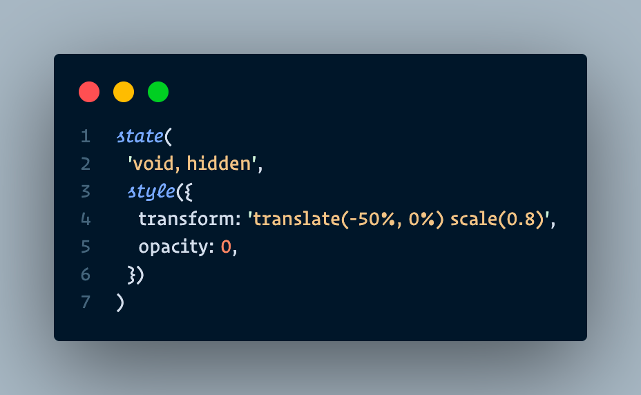
For the states that are needed to create the animations explained above, we will call them visible and hidden. We will also need a third state which is void. This is because the snackbar component will face the conditions where it is created but not yet part of the DOM when the page has finished loading, and also when it is removed from the DOM.
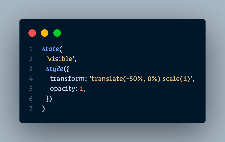
For the visible state, we want to make the snackbar has 1 opacity, transform with a scale(1) and translate(-50%, 0%) CSS functions. The scale(1) function creates an expanding effect when the snackbar is opening, while the translate function is there to make the snackbar appears in the bottom middle of the screen and will have no effect on the animation. See the code snippet below.
The hidden & void states will have the same styling, so they can be combined into a single state() function. In these conditions we want the snackbar to have 0 opacity, and transform with a scale(0.8) and translate(-50%, 0%). The scale(0.8) is to create a shrinking effect when the snackbar is closing, while the translate function is there for the same reason as the visible state. See the code snippet below.
Transition and Animate
Now that we have our states, it is time to define the transition between these states over some time, so that an "animation" can occur. For this, we are using the transition() function, which accepts two arguments.
The first one is an expression that defines the direction between two states. Example for the syntax of this expression is: 'someState' => 'anotherState'. This example means that the transition animation will happen when the bound element's state changes from 'someState' to 'anotherState'. Note that the => operator is needed between the states.
The second argument is the function animate(), which is the animation function that will be executed during the transition. This function accepts timings and styles arguments. The timings argument can be defined in multiple ways, but for this demo, we will use the ms unit in string format. The styles argument can be filled with CSS if we want some style change during the transition.
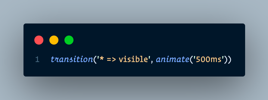
For this demo, we will make two transition functions. The first one is a transition from any state to the visible state. We want this transition to happen in 500ms so the animation can be more visible for this demo purpose. See the code snippet below.
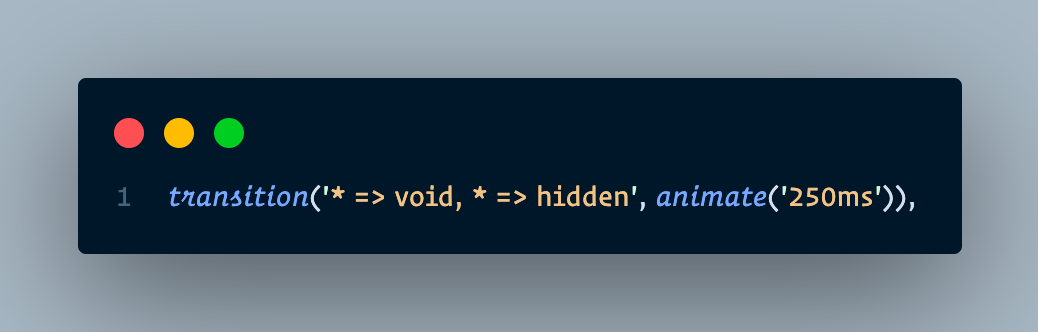
The second transition is from any state to the void state & from any state to the hidden state. Because we want to create the same transition for these two conditions, we can combine them in a single transition() function. We want this transition to happen in 250ms. See the code snippet below.
Triggering the Animation
Now that we have our states and transitions, the next thing we need is the trigger to start our animation. For this, we use the trigger() function that takes two arguments. The first argument is the name of the trigger, where we will use this name to attach it to the triggering element in the HTML template file. While the second argument collects the states and transitions we have made above in an array.
For this demo, we will name the trigger visibleHidden. We can see the full code below.
The last thing we need to do is to bind the trigger that we defined above to a variable that changes between the visible and hidden states and attach it to the div of our snackbar element, preceding it with the @ symbol inside brackets. See the template file below.
And now the setup & our animation creation is done! We are ready to test it out in the demo section.
Demo
Let's see the result of our snackbar component animation below.
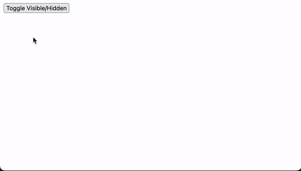
As we can see in the video above, when we first click the toggle button, the snackbar shows up on the bottom middle part of the screen with a fade-in and expanding effect. This is the result of the transition from the * state to the visible state. During this transition, the styling we defined on the visible state takes effect, where the opacity of the snackbar gradually increases to 1 and scales up to 100% of its size.
When we click the button again, the snackbar disappears with a fade-out and shrinking effect. This is the result of the transition from the * state to the void, hidden state. During this transition, the styling we defined on the void, hidden state takes effect, where the opacity gradually decreases to 0 and scales down to 80% of its original size.
These animation sequences happen in 500ms and 250ms for the visible and hidden state respectively, which are the results of the values that we put on the animate function of each of its transition functions. Furthermore, outside demo conditions, these animate values should be lower so that users can experience much smoother and more fluid animations.
Conclusion
Animation is usually seen as an advanced subject when it comes to building a web application, but the addition of it is a great way to enhance the appearance of your web application. Moreover, animation can also improve the app's overall user experience, which is an essential topic in this modern age where people use web applications for their daily work and activities.
Angular Animations (@angular/animations) is a great starting point to start adding animations to your web application. This module is included in your Angular project if you created it using the CLI. The animations created with this module are based on CSS, but it provides us with a better way of controlling or arranging those animations.
In this article, we successfully created a simple fade-in and fade-out animation on a snackbar component using Angular Animations. However, what is shown here only shows the surface of what Angular Animations can do. There are still a lot of methods and functionalities that have not been covered yet, and it is certainly capable of creating a more complex, fluid, and beautiful animation than what is shown here.
References
- Angular documentation: https://angular.io/guide/animations
- Angular Animations Explorer by
williamjuan027: https://williamjuan027.github.io/angular-animations-explorer
Join us
Scalability, reliability, and maintainability are the three pillars that govern what we build at Halodoc Tech. We are actively looking for engineers at all levels and if solving hard problems with challenging requirements is your forte, please reach out to us with your resumé at careers.india@halodoc.com.
About Halodoc
Halodoc is the number 1 all-around Healthcare application in Indonesia. Our mission is to simplify and bring quality healthcare across Indonesia, from Sabang to Merauke. We connect 20,000+ doctors with patients in need through our Tele-consultation service. We partner with 3500+ pharmacies in 100+ cities to bring medicine to your doorstep. We've also partnered with Indonesia's largest lab provider to provide lab home services, and to top it off we have recently launched a premium appointment service that partners with 500+ hospitals that allow patients to book a doctor appointment inside our application. We are extremely fortunate to be trusted by our investors, such as the Bill & Melinda Gates Foundation, Singtel, UOB Ventures, Allianz, GoJek, Astra, Temasek, and many more. We recently closed our Series C round and In total have raised around USD$180 million for our mission. Our team works tirelessly to make sure that we create the best healthcare solution personalised for all of our patient's needs, and are continuously on a path to simplifying healthcare for Indonesia.